


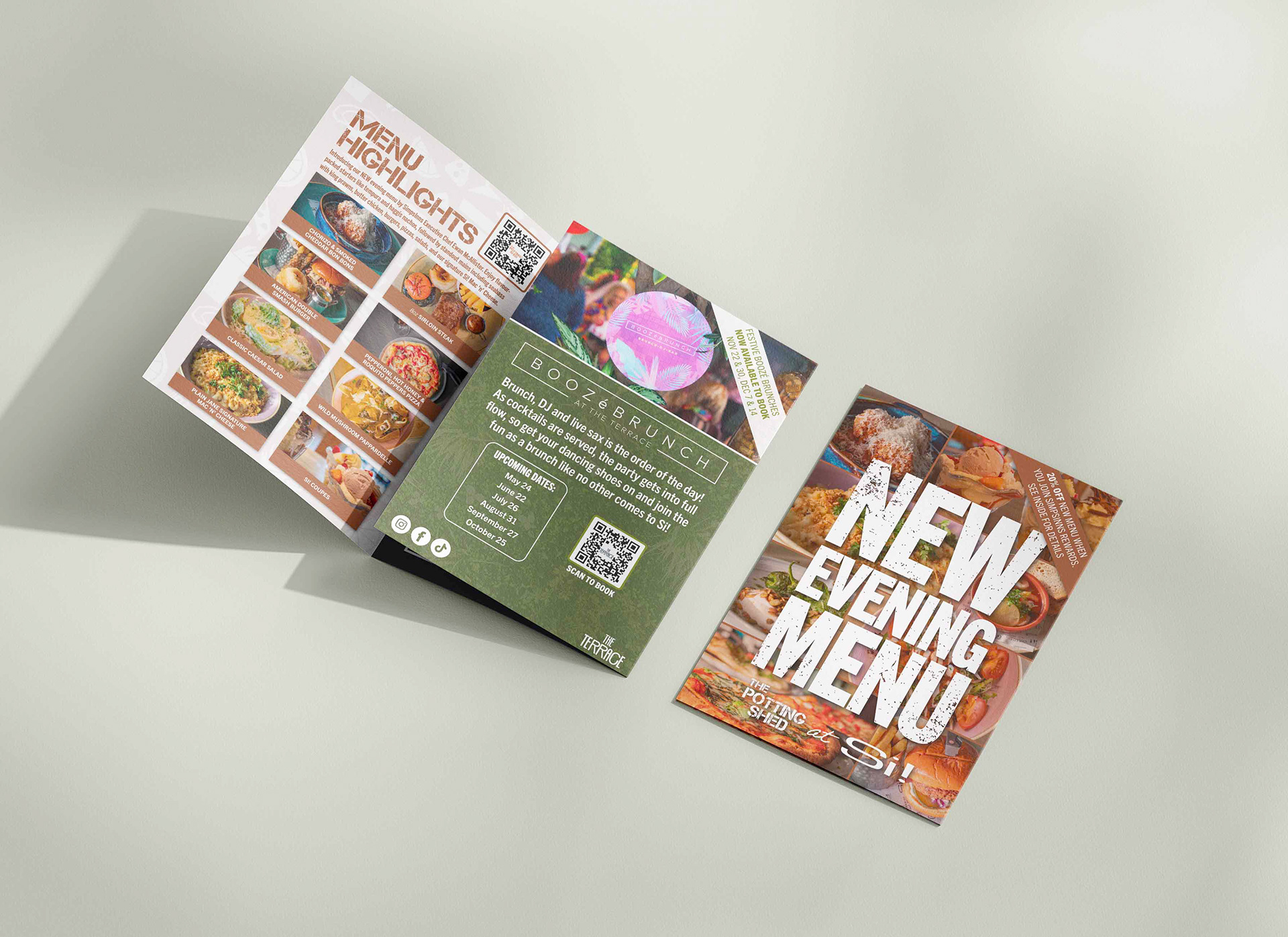


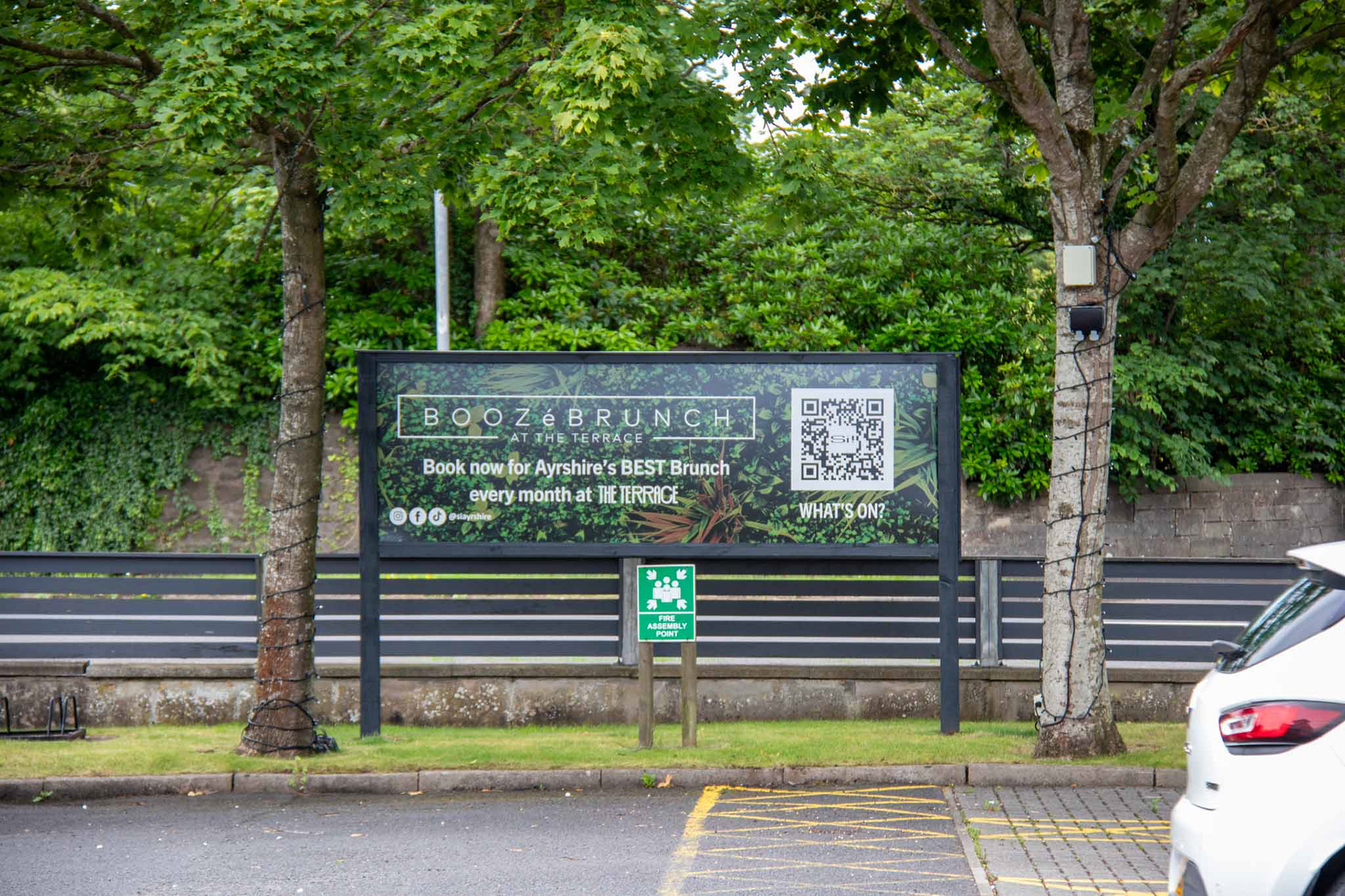

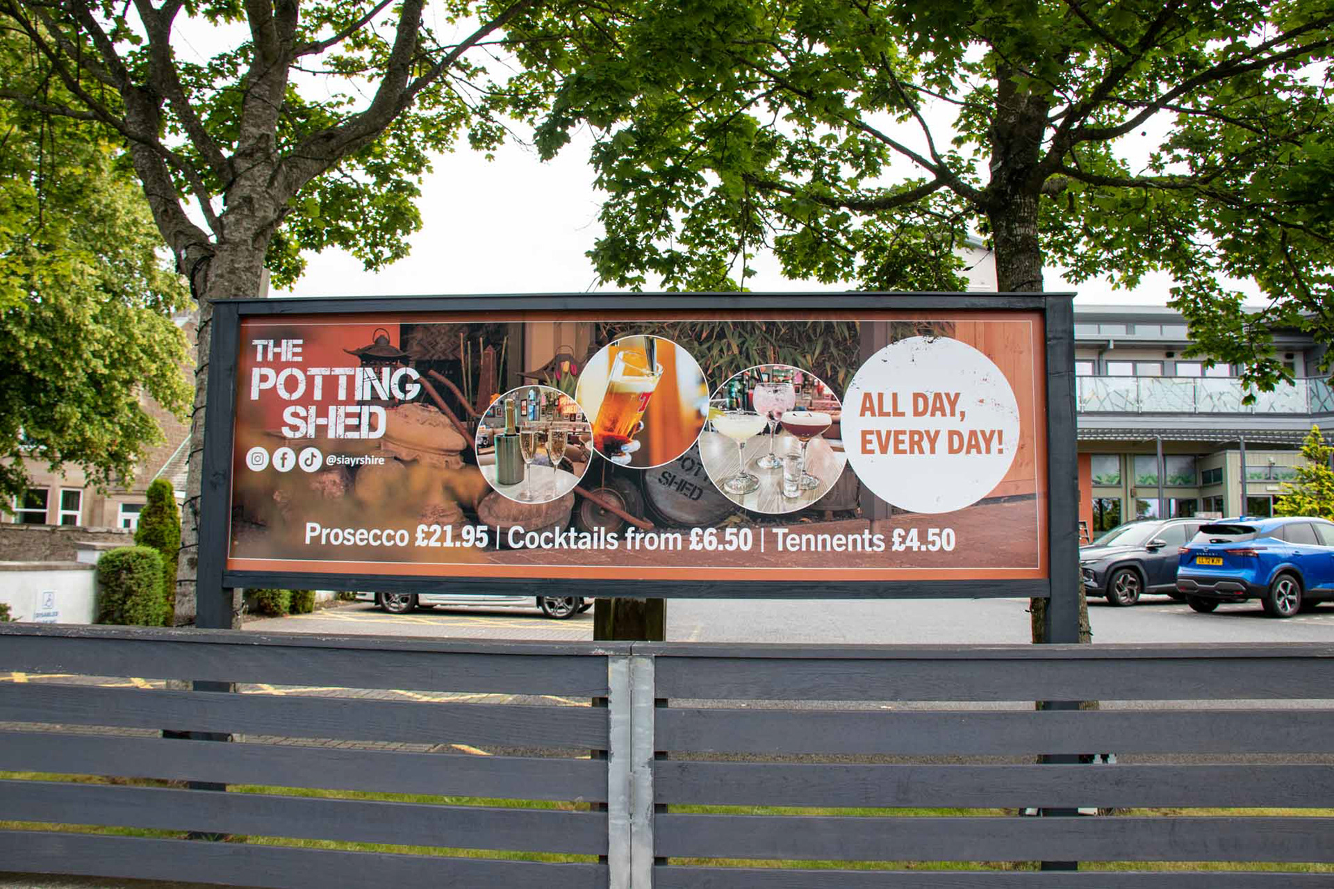


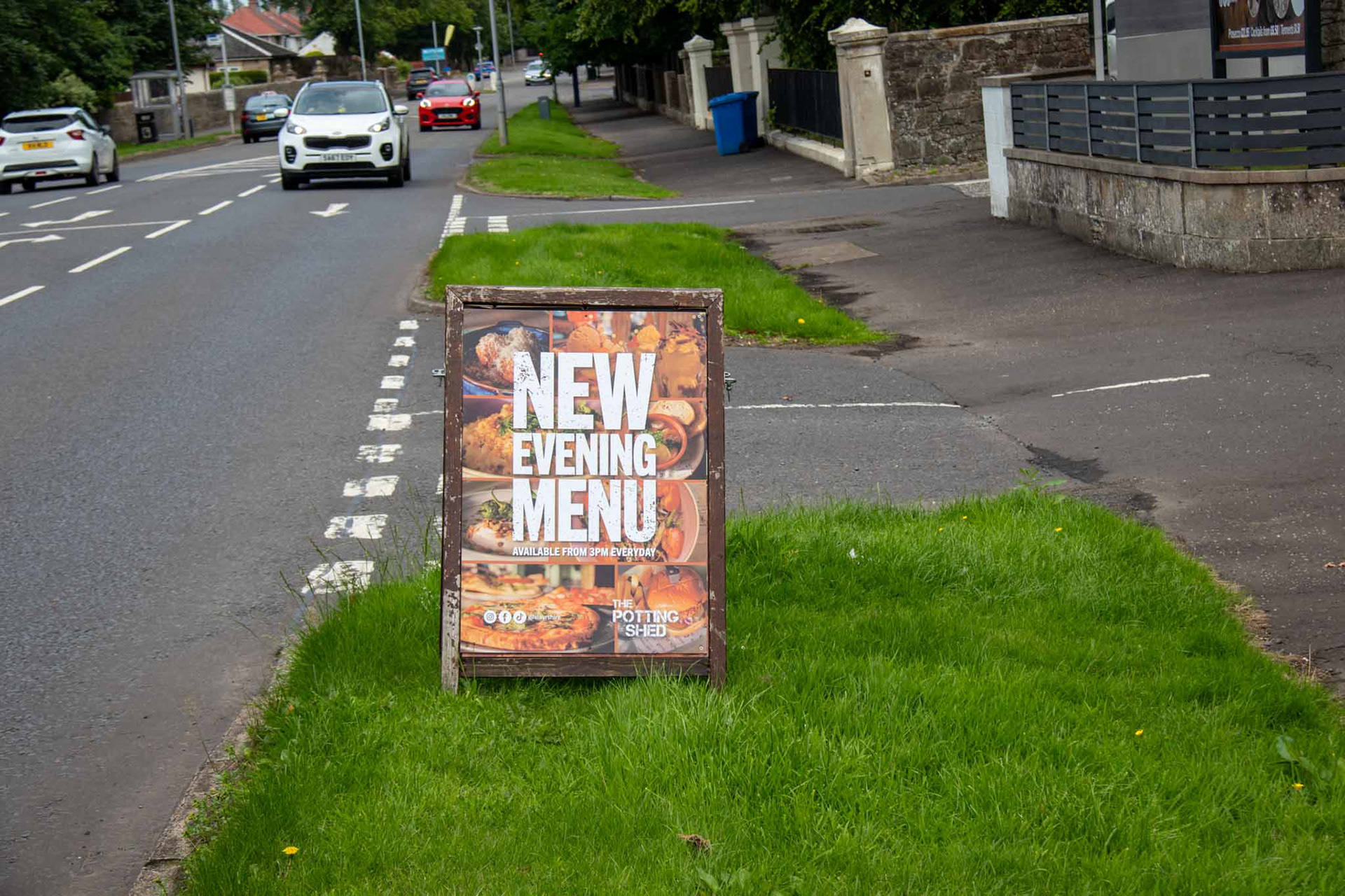
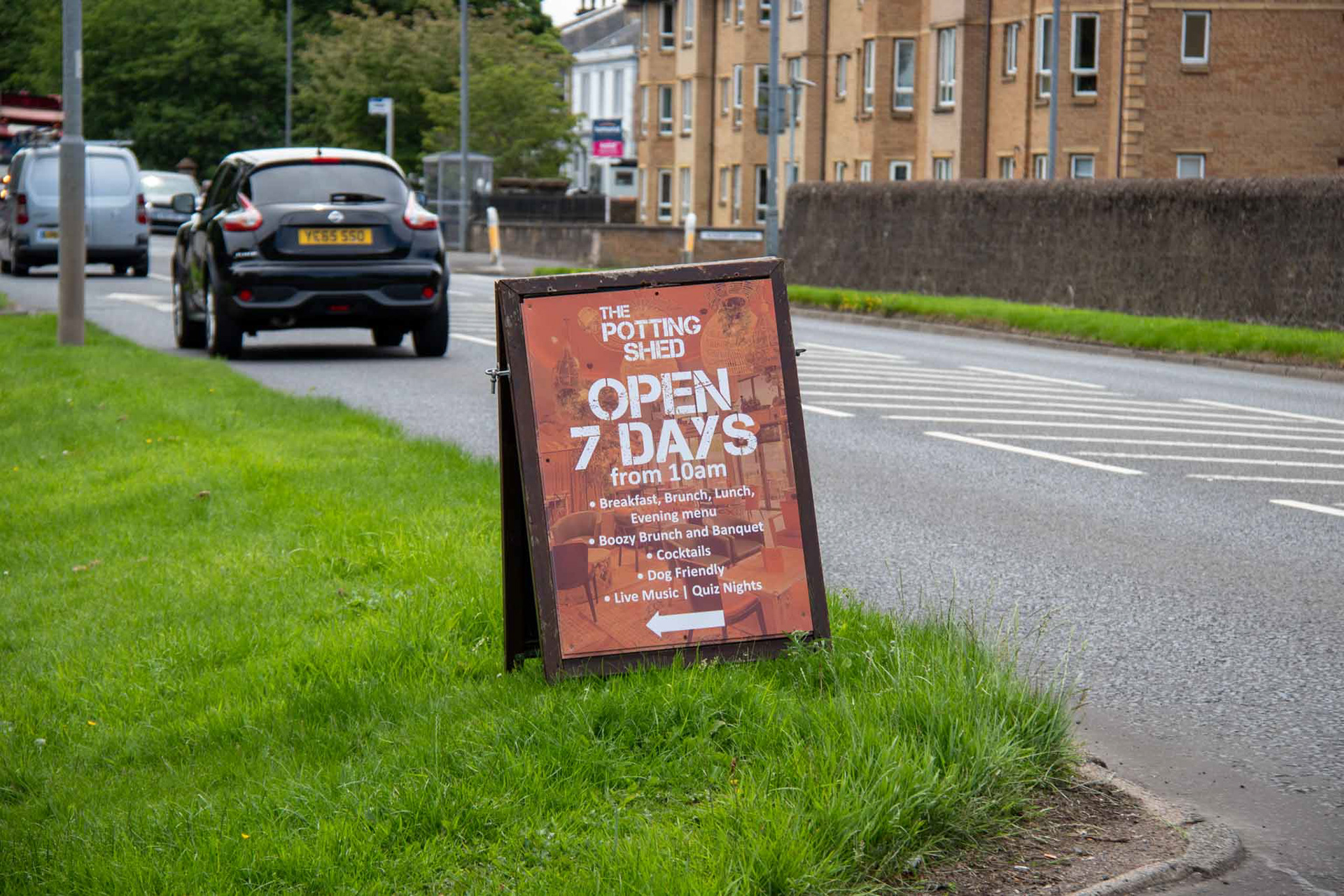
Promotional Design for The Potting Shed
I created a variety of promotional materials for The Potting Shed in Irvine, designed to enhance brand visibility and customer engagement. This included event posters, a promotional leaflet, a hot drink token card, and outdoor signage, all tailored to reflect the venue’s fun, welcoming identity. The materials were used both in-house and externally, helping to promote offers, events, and seasonal campaigns while maintaining a cohesive visual style across all touchpoints.


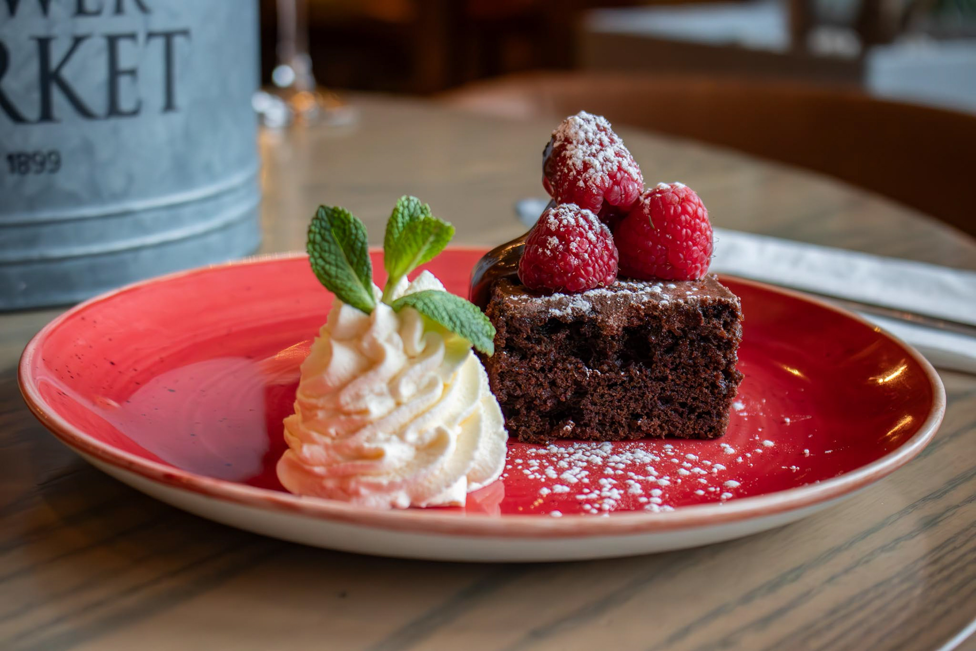
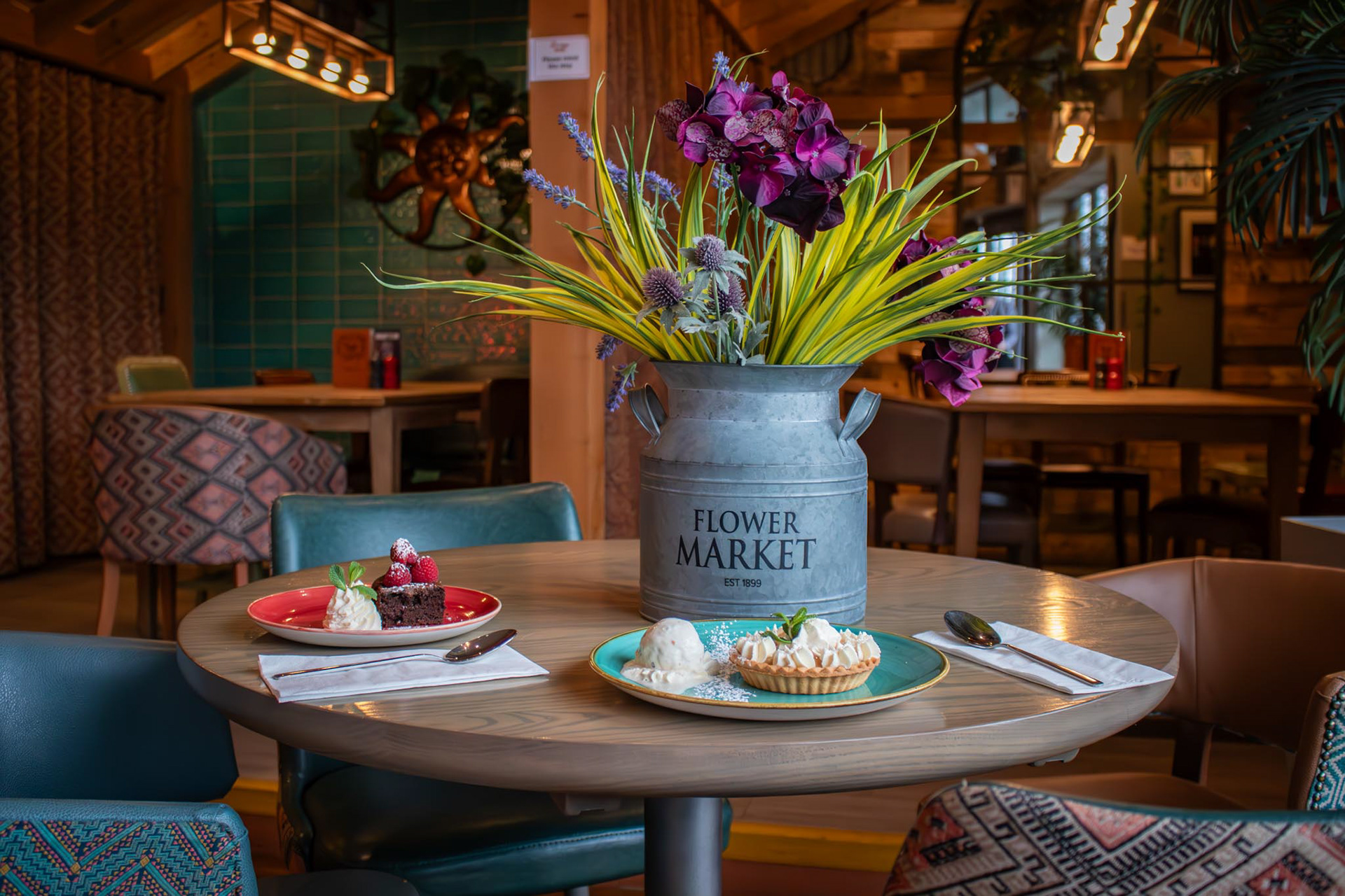
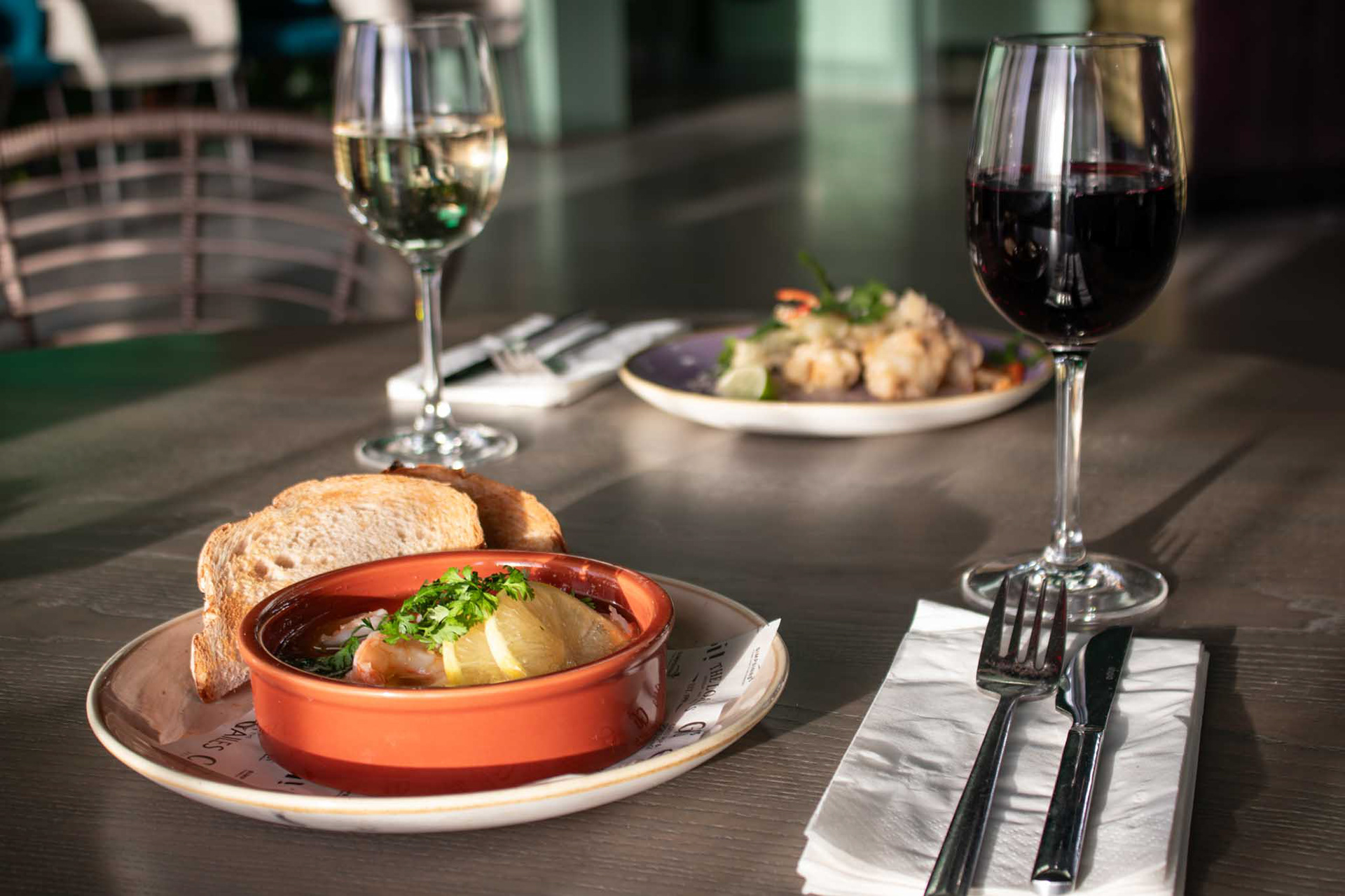
Mother’s Day Menu Photography
To support the launch of The Potting Shed’s Mother’s Day menu, I produced a collection of food photography capturing the presentation, colour, and appeal of each dish. The images were styled and lit to reflect the warmth and celebratory nature of the occasion, and were used across digital channels and printed menus to help drive bookings and showcase the quality of the offering.


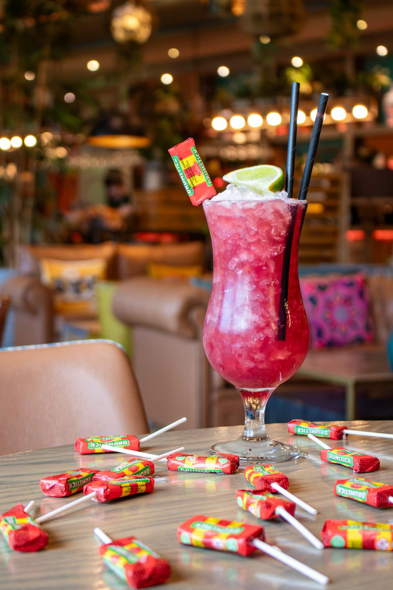
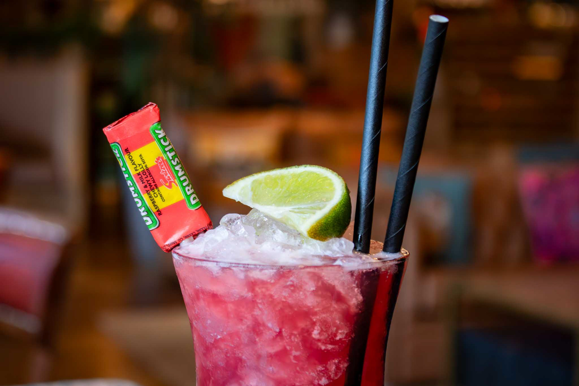

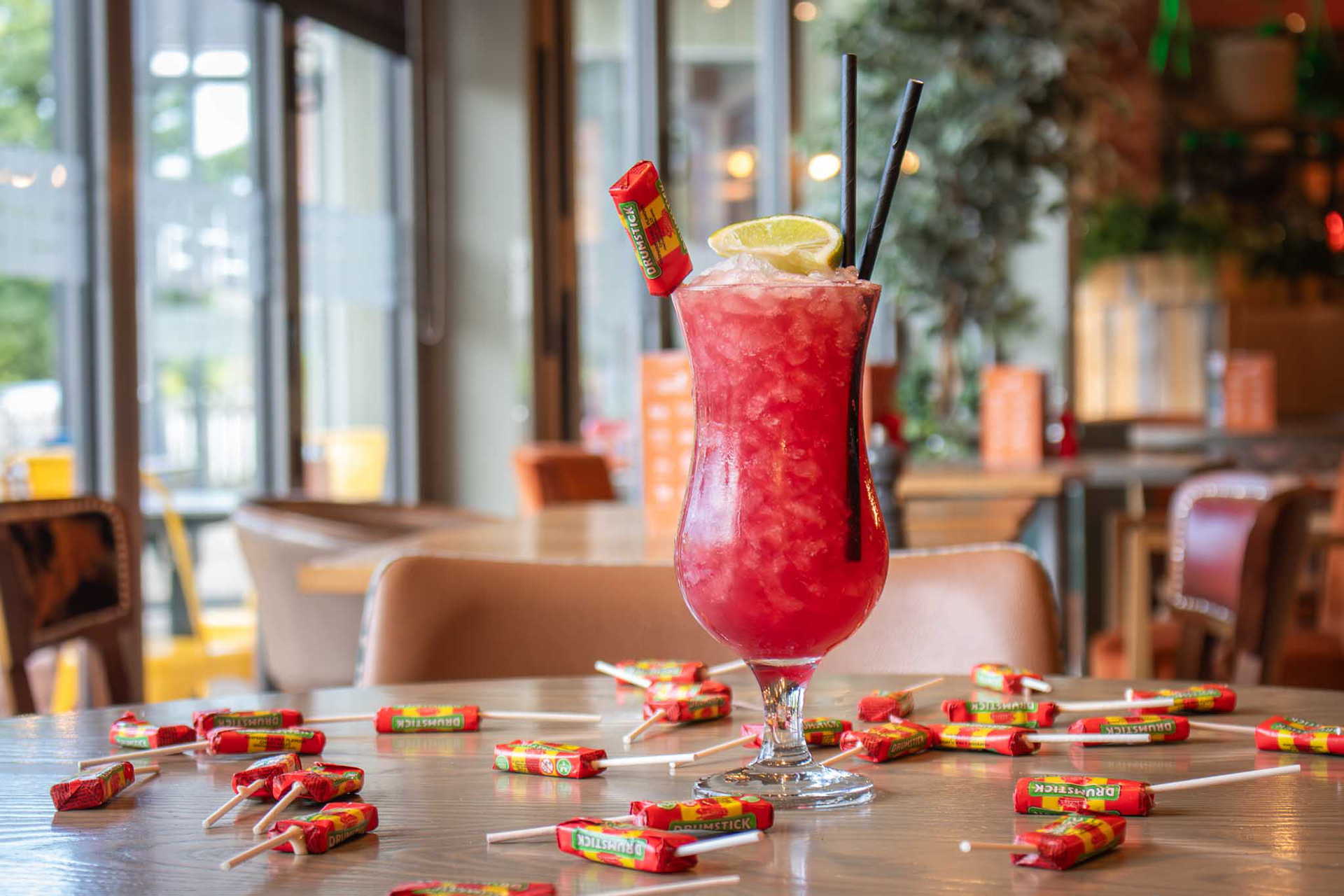
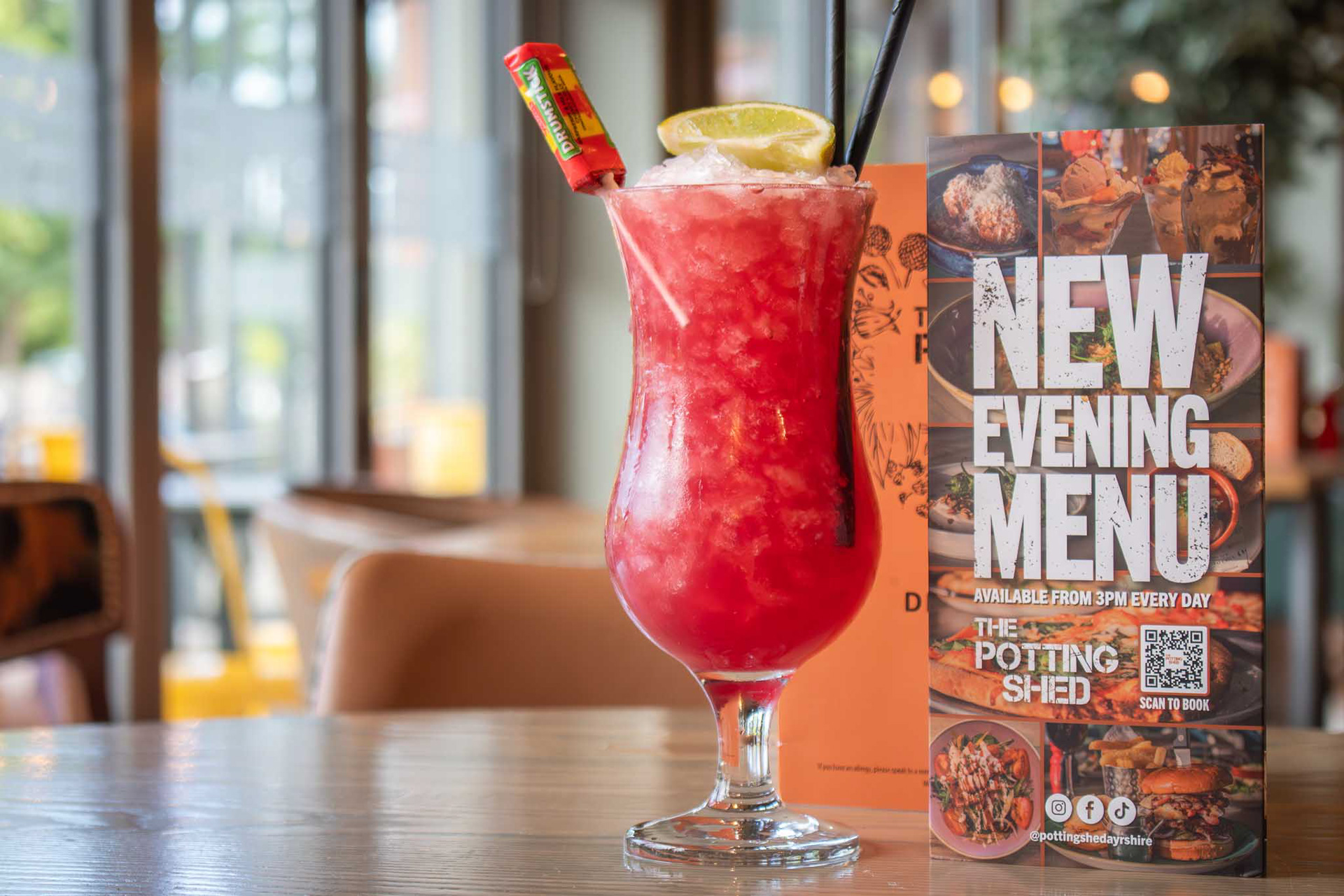
Drumstick Cocktail Campaign Shoot
I carried out a dedicated photoshoot to promote The Potting Shed’s Drumstick cocktail, with the aim of creating bold, eye-catching visuals that matched the cocktail’s playful theme. The imagery focused on vibrant colours, dynamic composition, and a fun, slightly nostalgic feel—perfect for social media promotion and in-house marketing. The campaign helped highlight the venue’s creative drinks offering and seasonal specials.

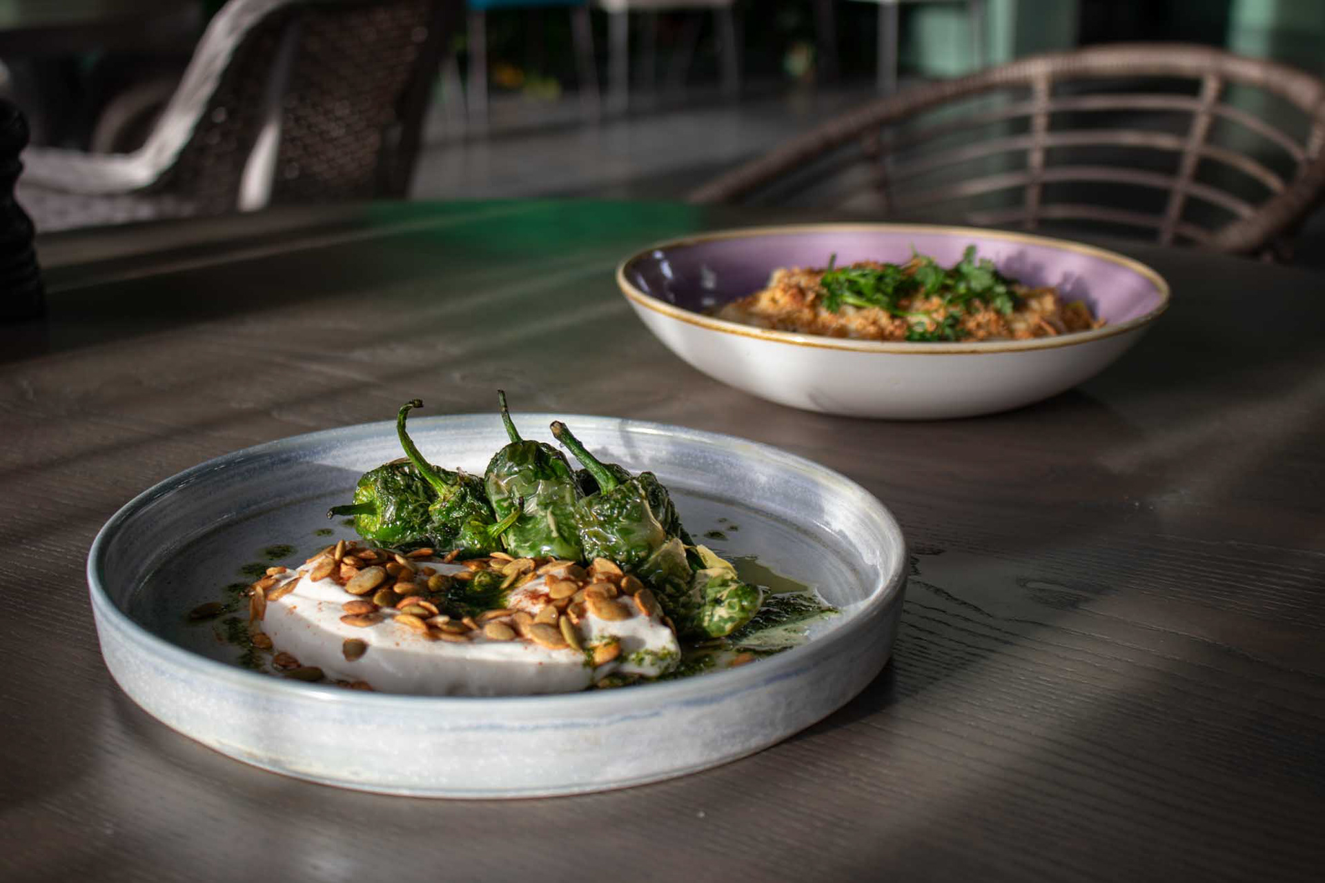
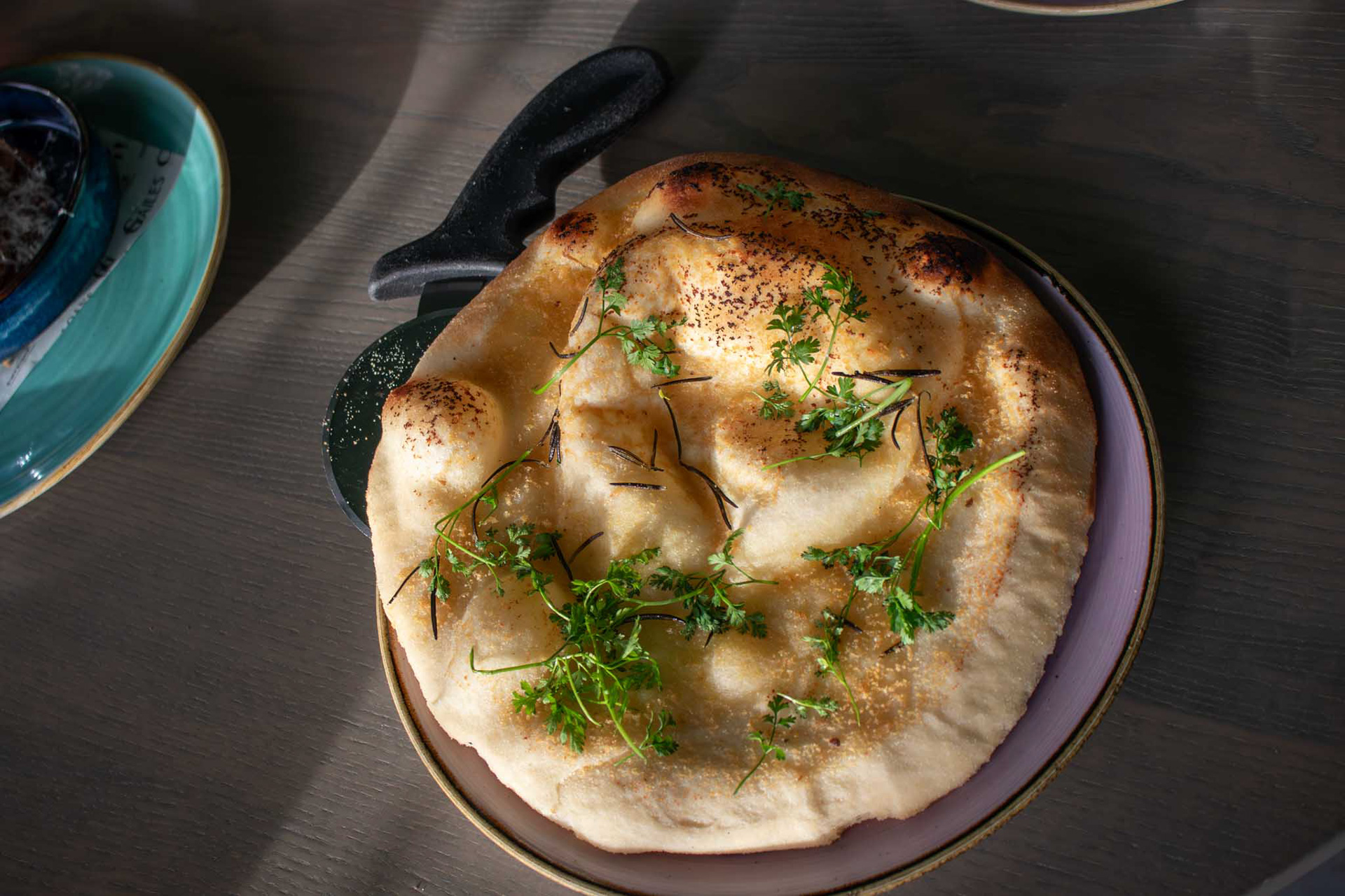


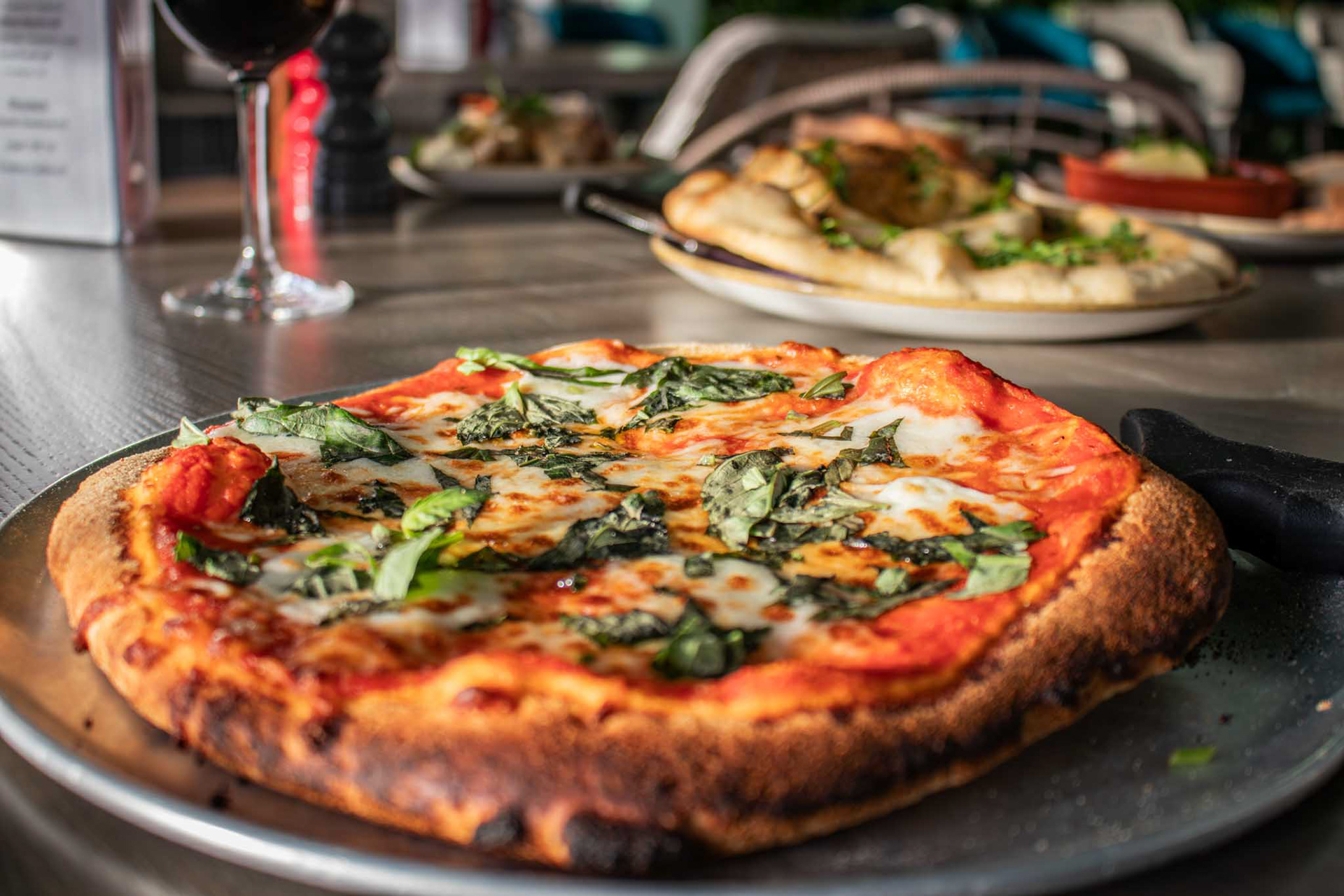
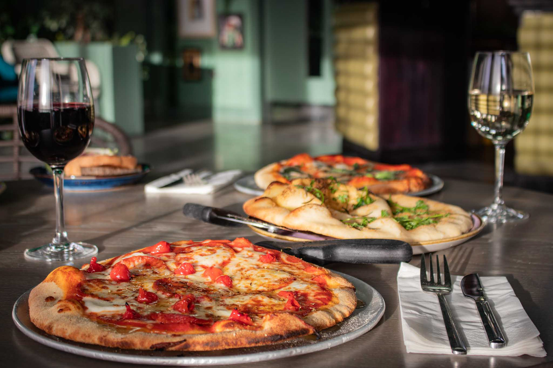
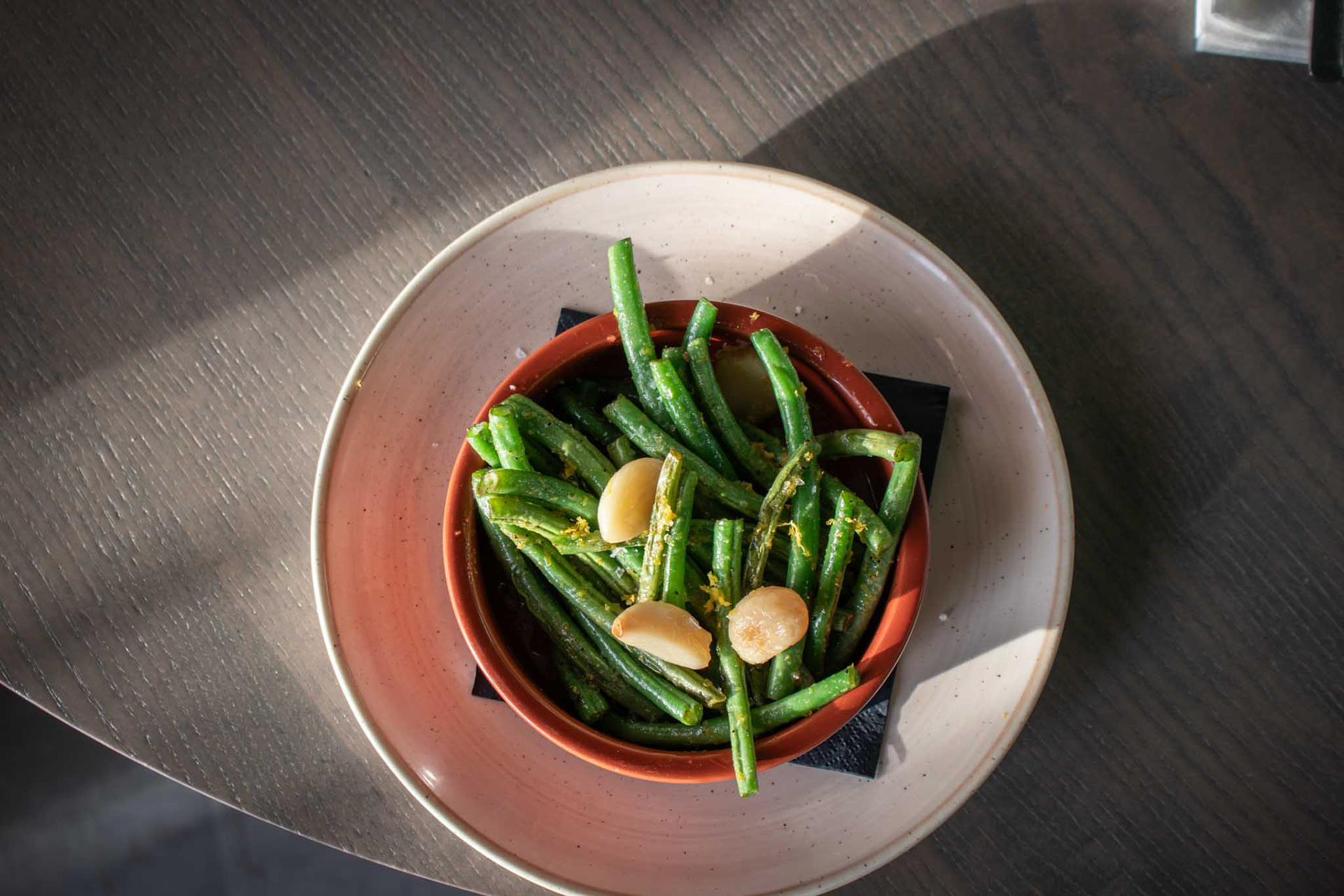
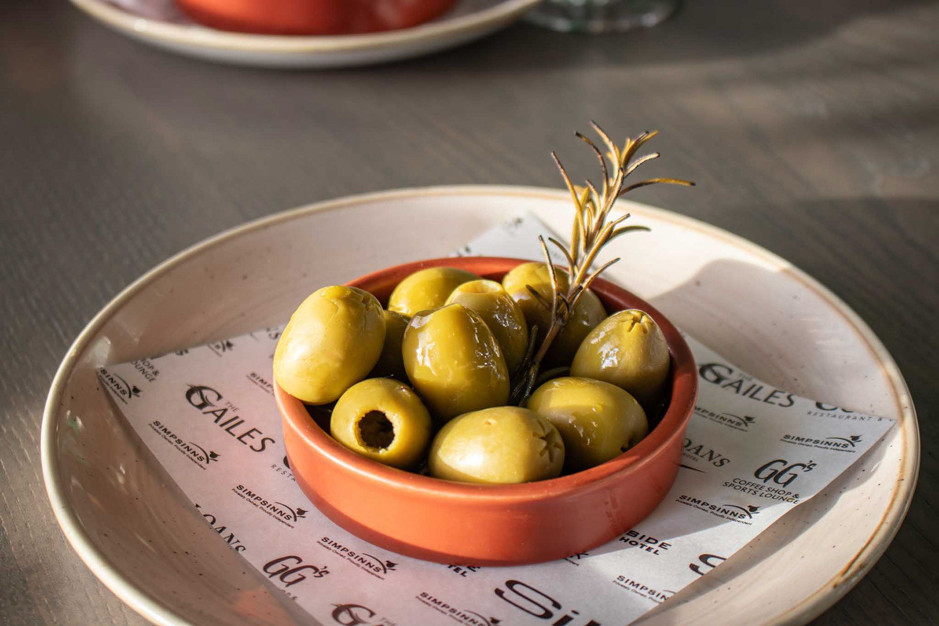
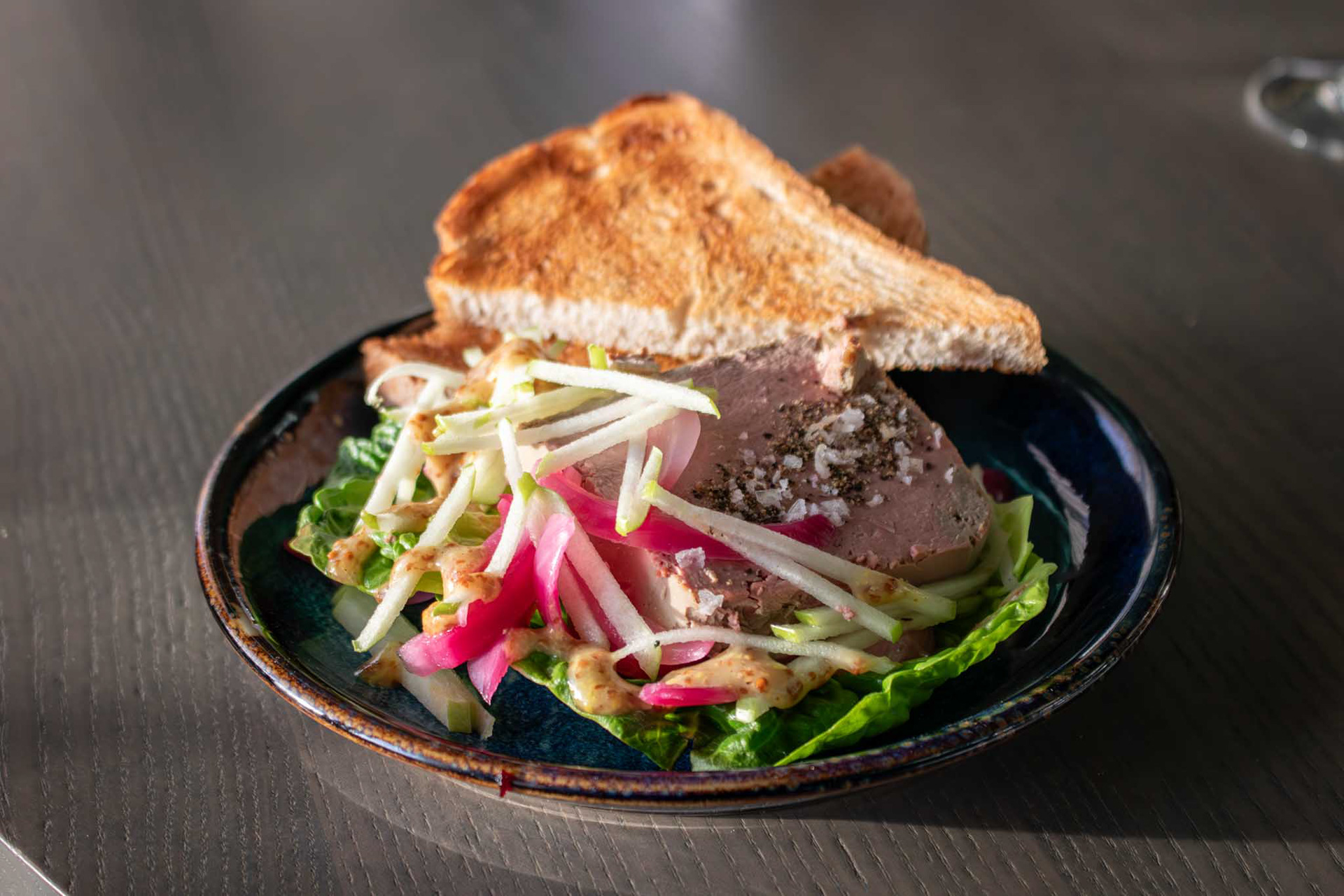
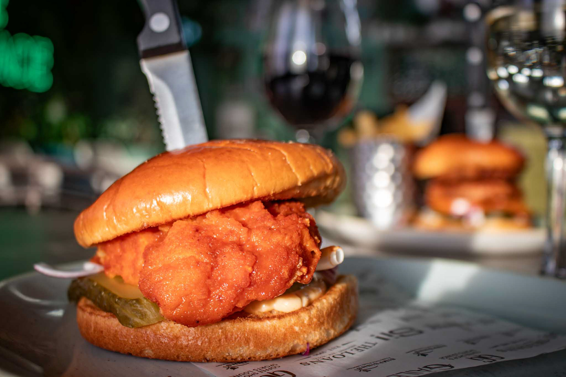


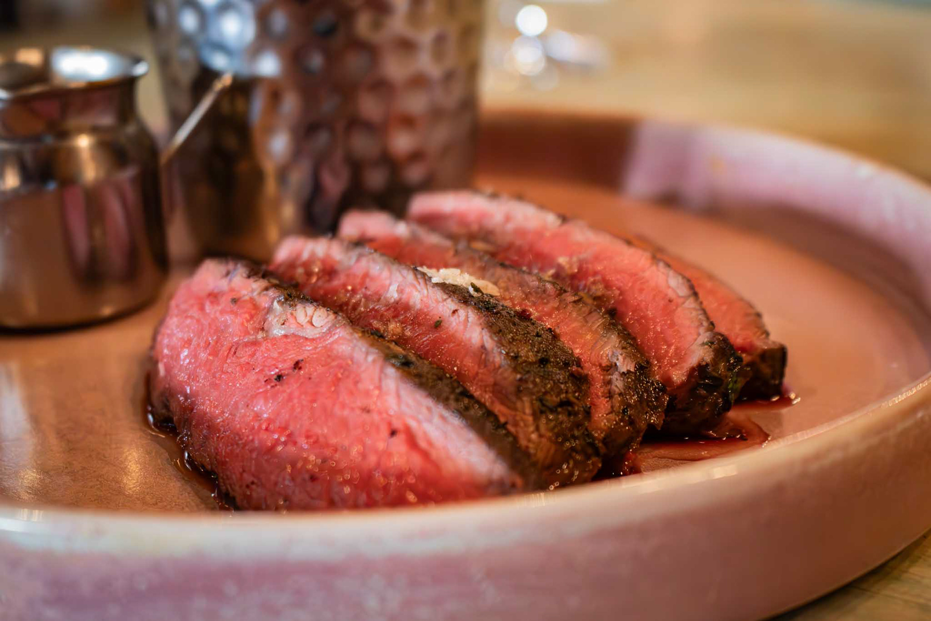
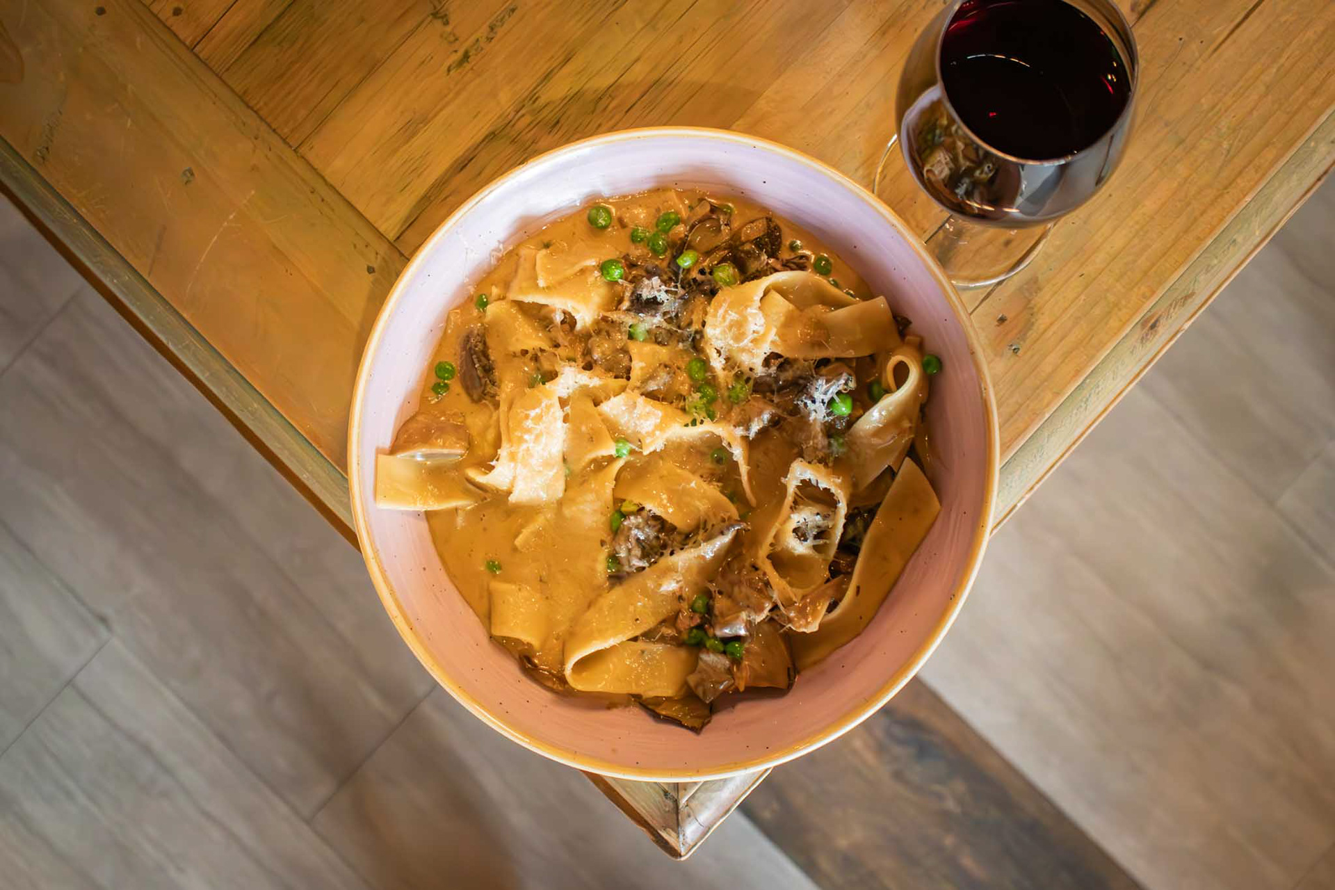


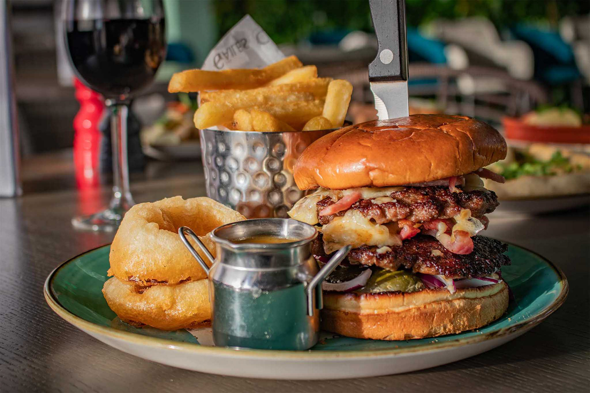
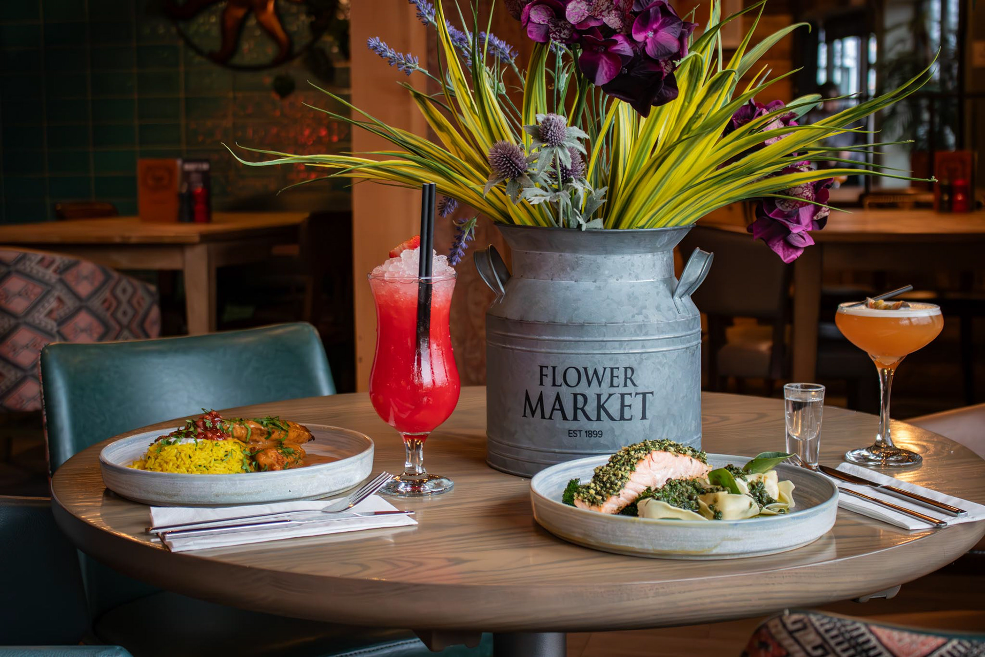
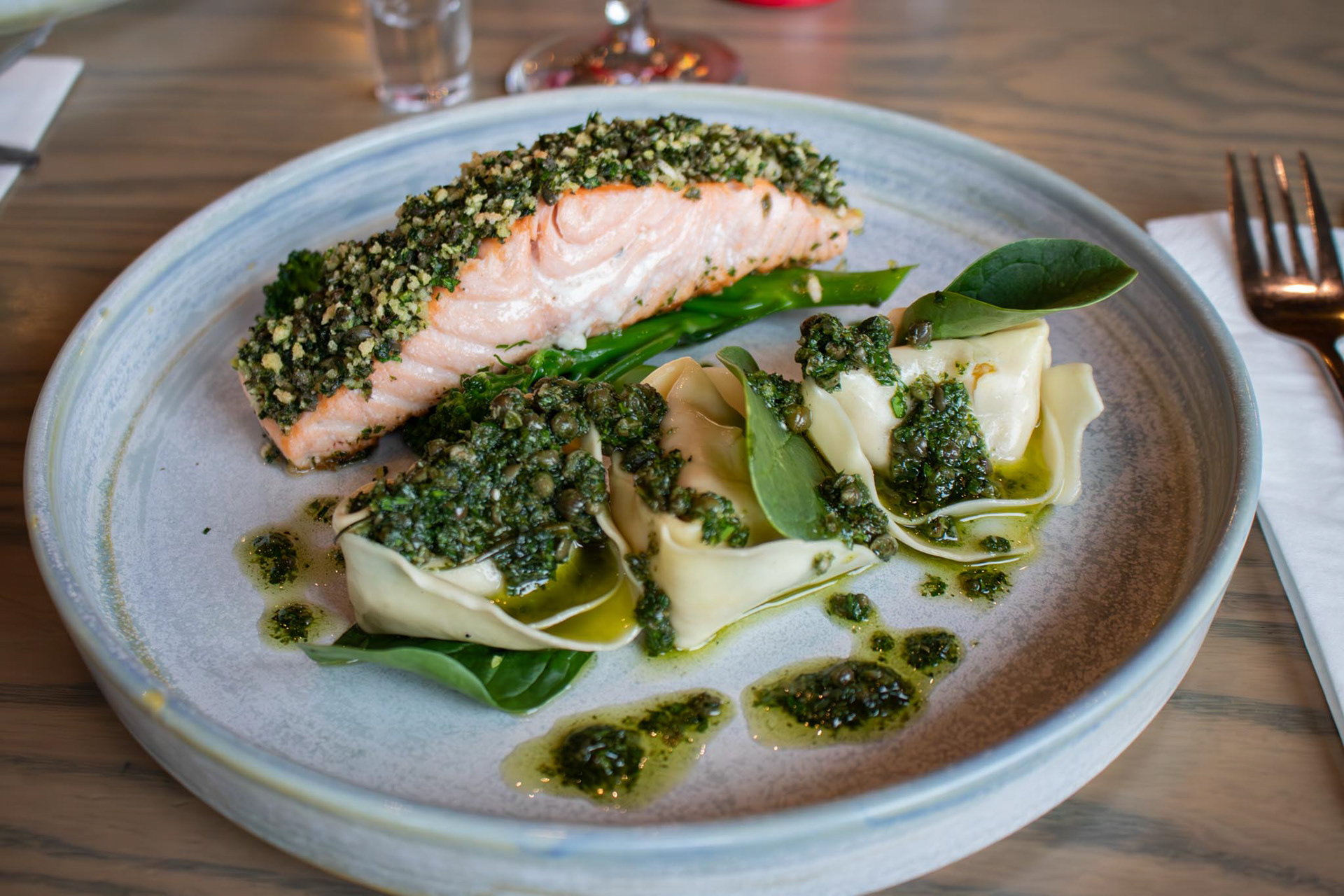
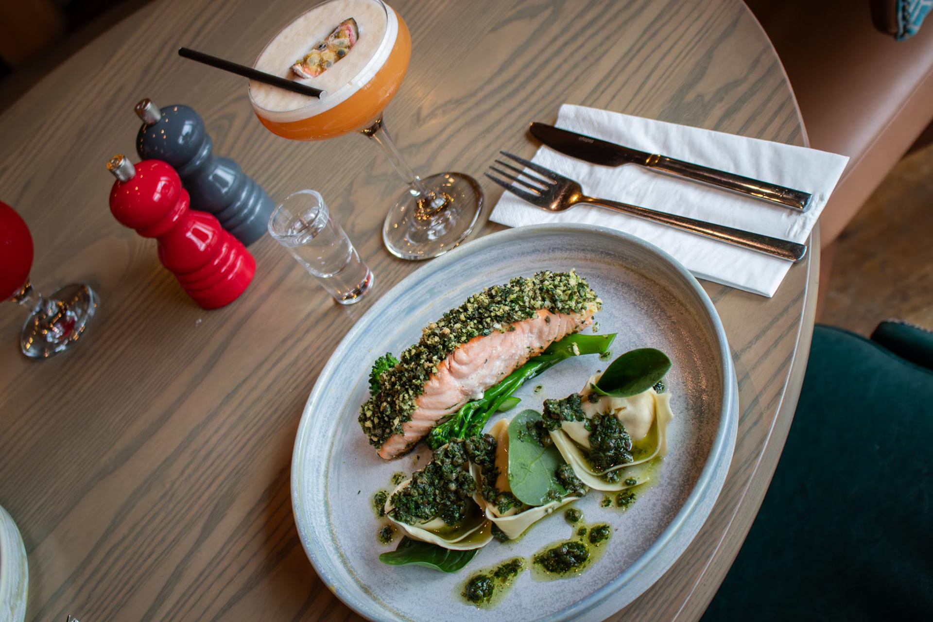
New Menu Food Photography
Earlier this year, The Potting Shed launched a brand new food menu, and I was responsible for photographing the full range of dishes. The aim was to showcase the freshness, variety, and presentation of the updated offering, with imagery used across social media, website, and printed materials. Each dish was styled and captured to reflect the restaurant’s vibrant, casual dining atmosphere and to visually communicate the quality behind the new menu.
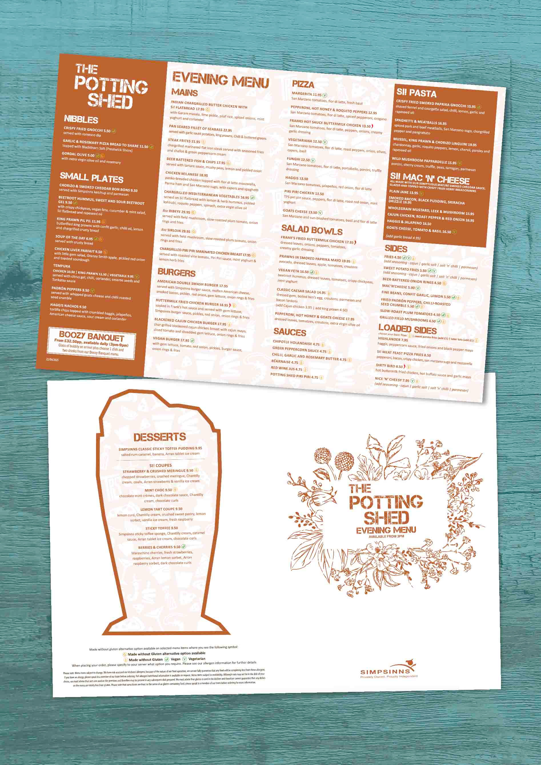
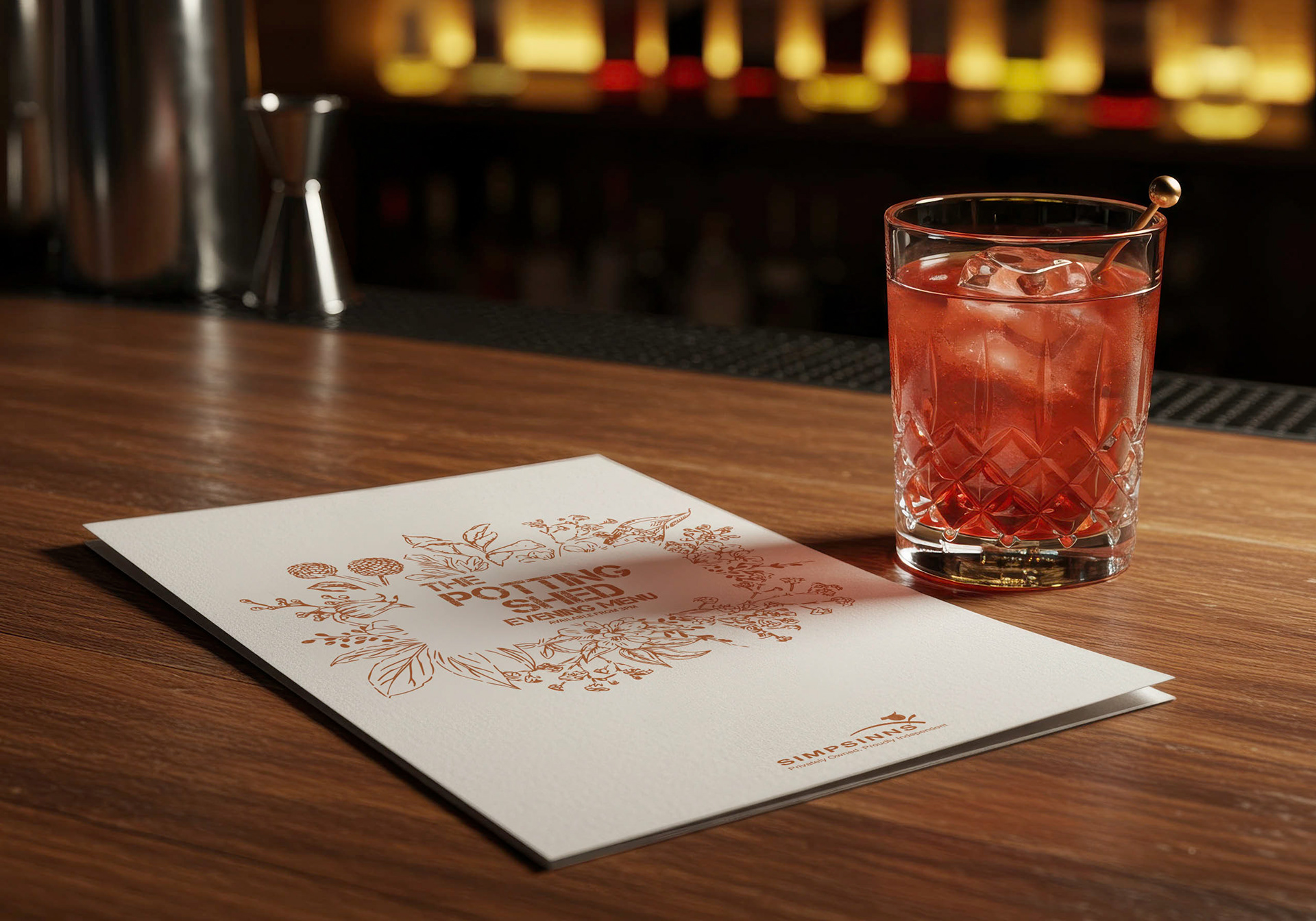
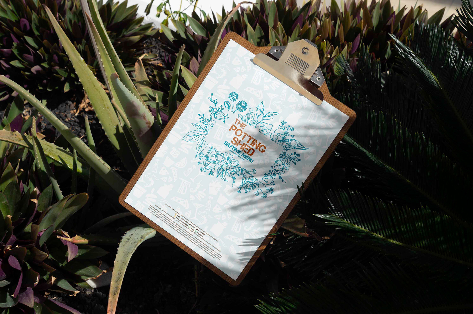
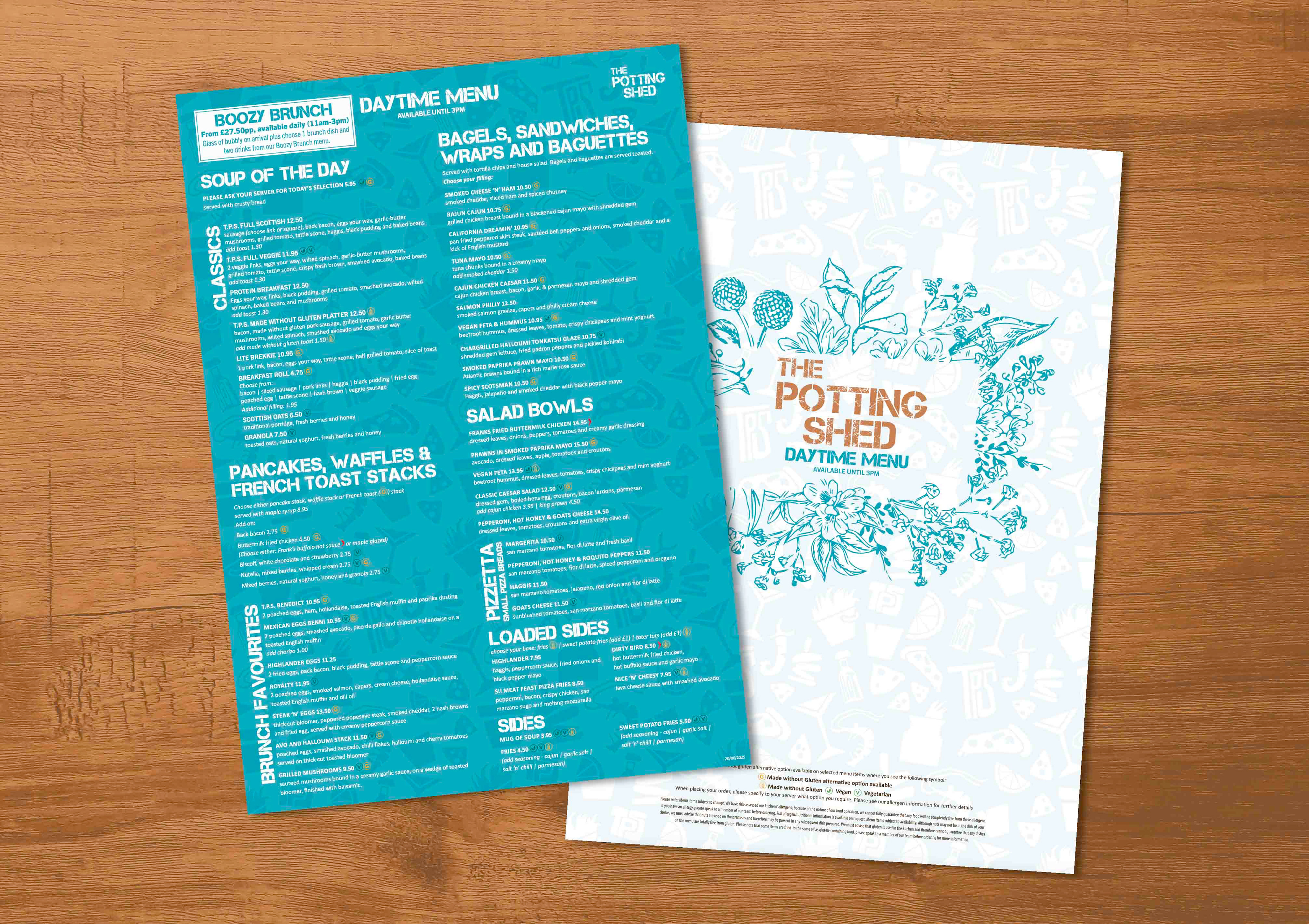
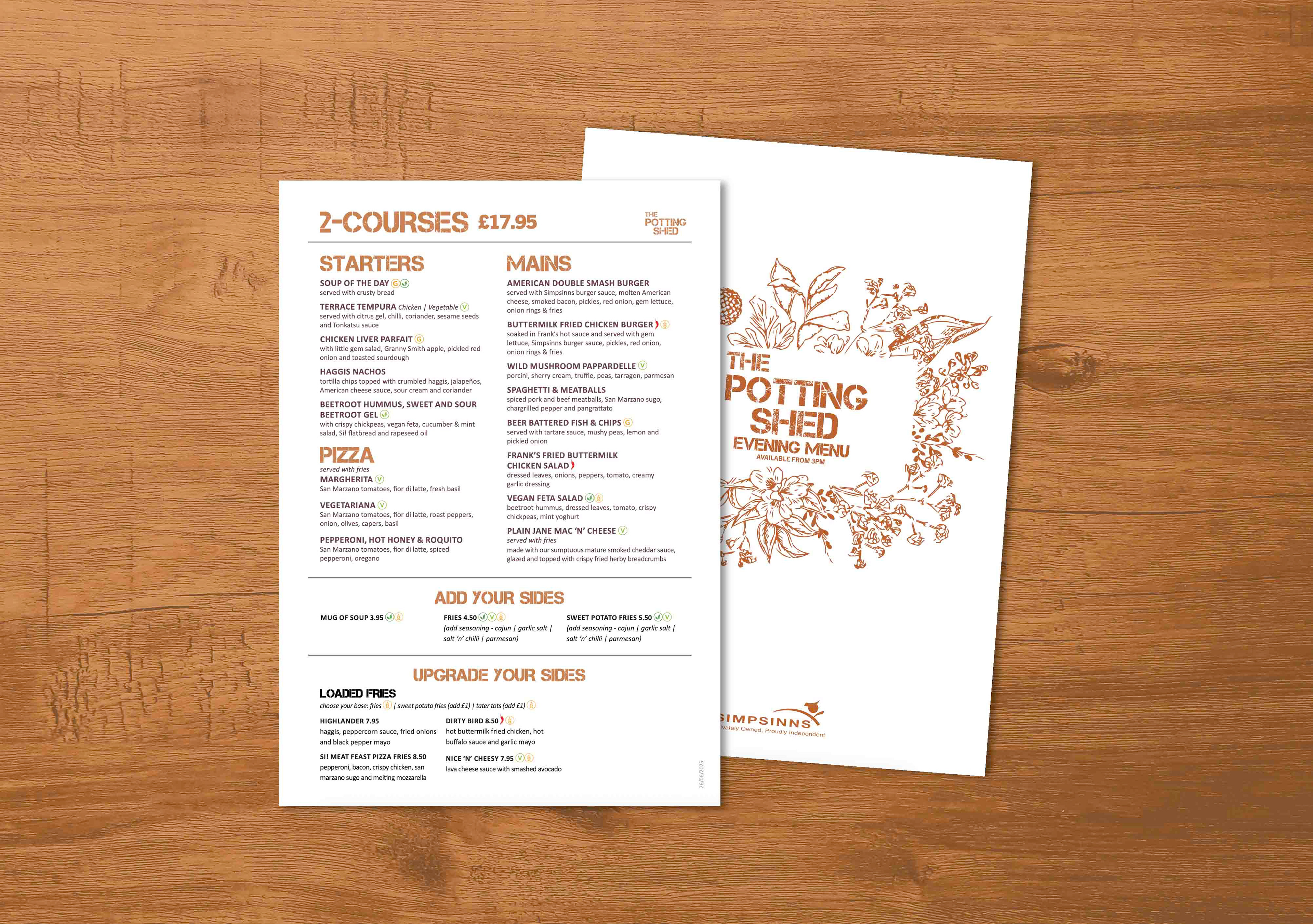
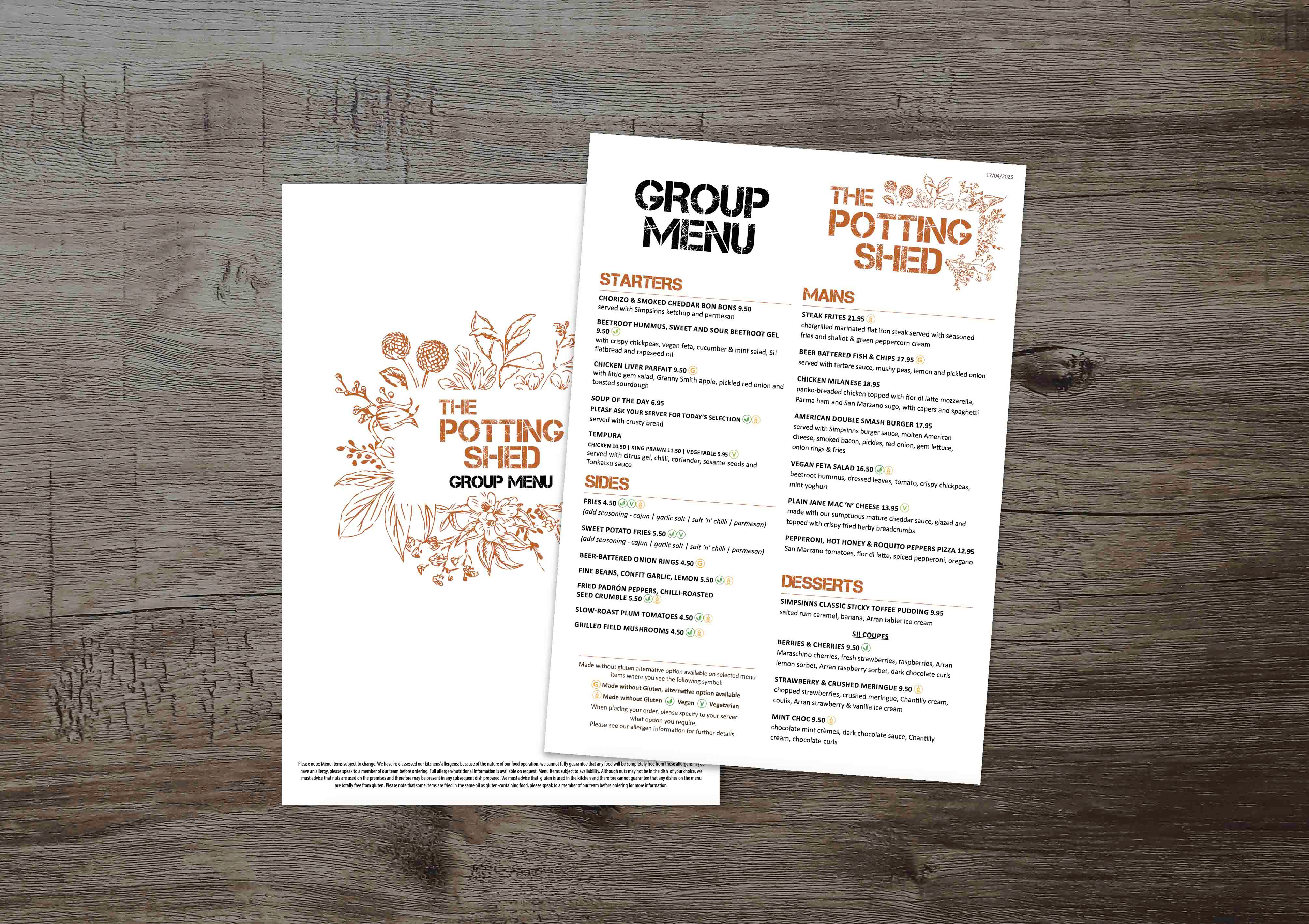
Menu Design & Brand Development
Alongside the new menu launch, I designed a fresh set of menus that reflect The Potting Shed’s evolving brand. The designs feature a clean, modern layout and use the brand’s signature orange, complemented by a newly introduced light blue to create a clear contrast between the daytime and evening offerings—blue for daytime, orange for evening. The result is a visually engaging and easy-to-navigate design that maintains brand consistency while introducing a refined sense of structure and tone across the menus.