
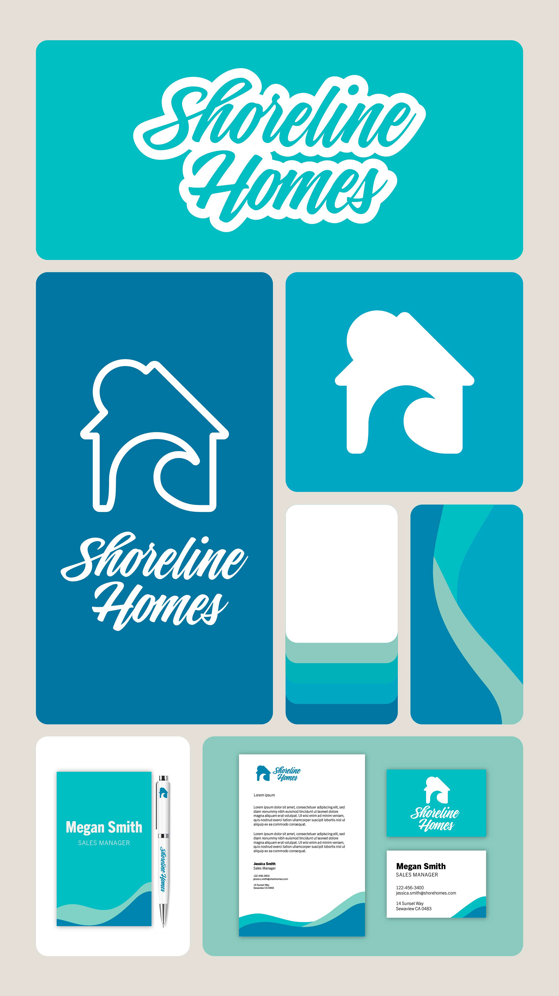
Shoreline Homes – Brand Design
Shoreline Homes is a real estate agency based on Australia’s Gold Coast, specialising in relaxed coastal living. The brand needed a full identity that captured its approachable, professional nature while reflecting its connection to the sea and the idea of home.
I developed a complete brand package including logo, colour palette, business cards, and stationery. The logo features a simple house shape with a wave inside, symbolising coastal lifestyle and comfort. The overall look is clean, calm, and confident—perfectly suited to the Gold Coast market.
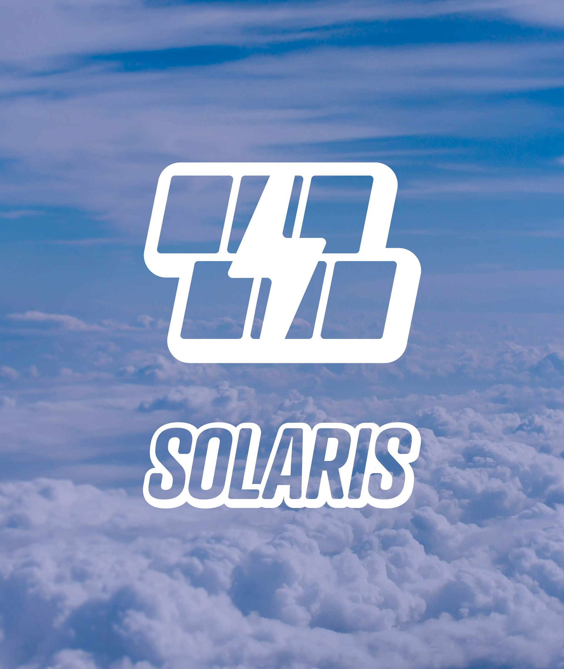
Solaris – Logo Design
Solaris is a modern solar energy company focused on sustainable, forward-thinking solutions for homes and businesses. The brand needed a visual identity that reflected both innovation and environmental responsibility.
I created a sleek, contemporary logo that conveys clarity, energy, and trust. With clean lines and a minimal aesthetic, the design captures the essence of a company built around smart, renewable power and a brighter future.
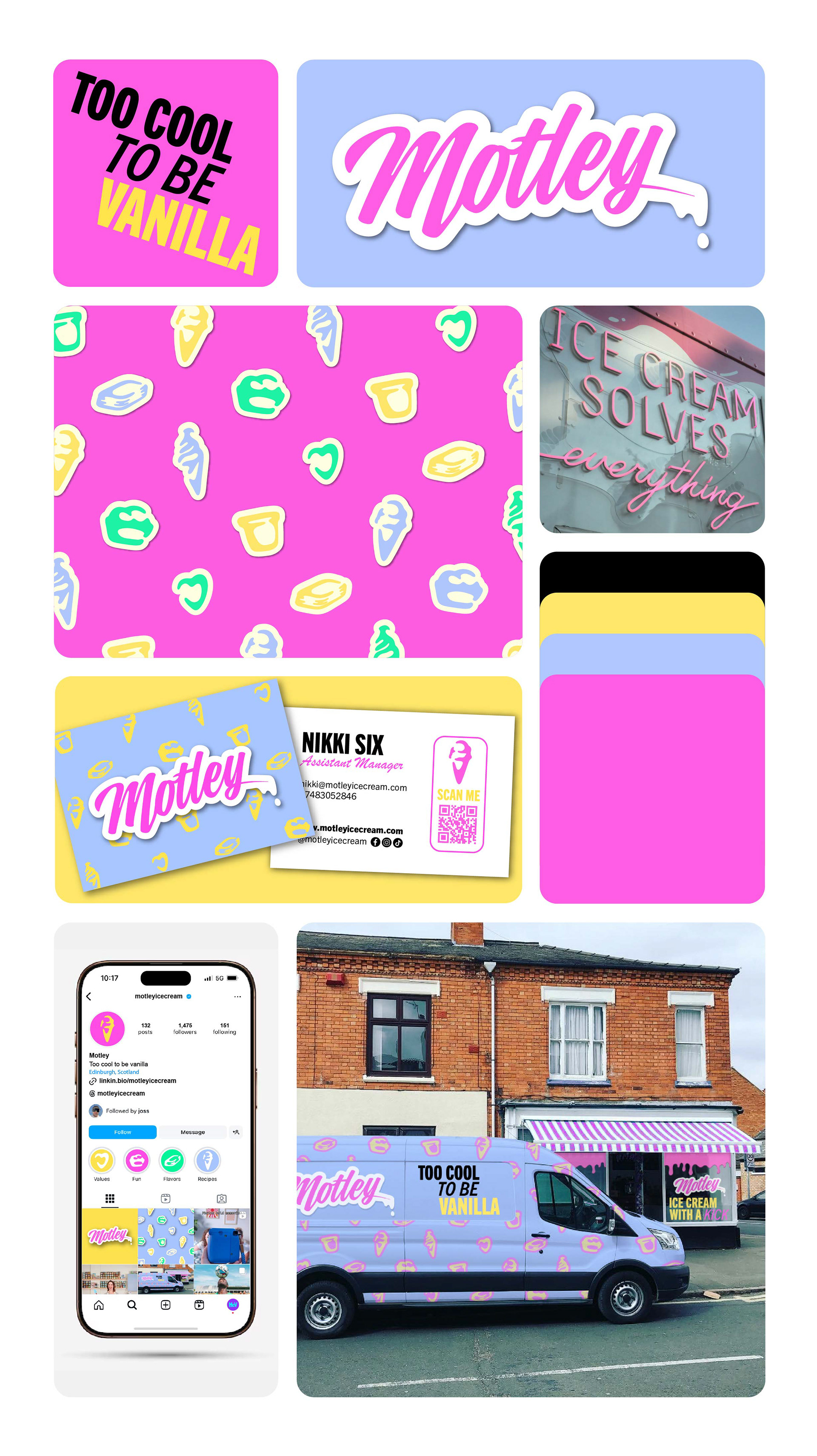
Motely – Brand Design
Motely is a bold, attitude-filled ice cream shop based in Brighton, taking inspiration from the glam rock spirit of Mötley Crüe. Known for its playful energy and bright pastel colours, the shop offers a fun, rebellious twist on the classic scoop.
I created a full brand package including logo, colour palette, signage, packaging, and social media assets. The identity blends rock ‘n’ roll edge with candy-coloured charm—striking a balance between cool and approachable, just like the brand itself.
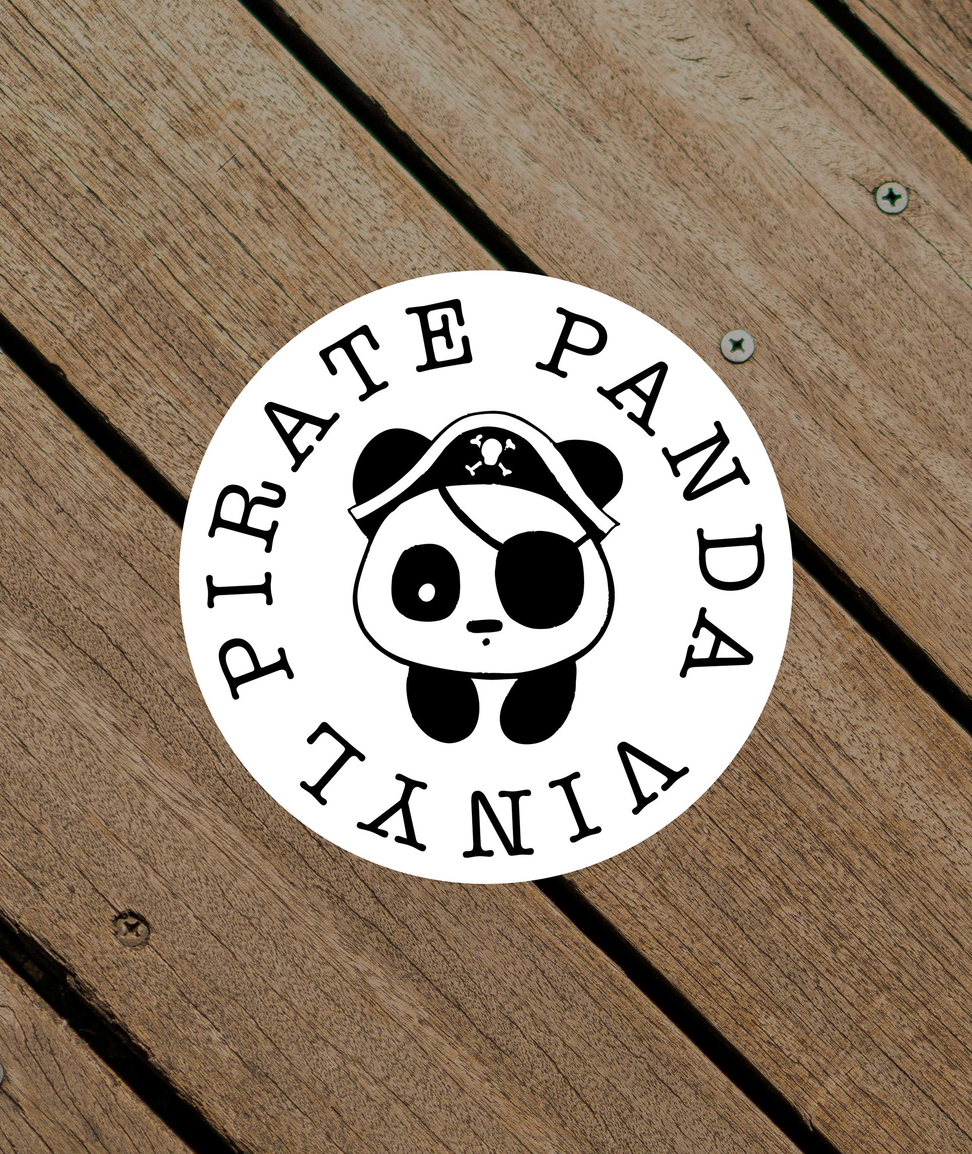
Pirate Panda Vinyl — Logo Design
Pirate Panda Vinyl is a small, quirky record store with a love for rare finds, hidden gems, and a laid-back vibe. It’s a space for crate-diggers and music lovers who appreciate character as much as collection.
I created a hand-drawn style logo featuring a pirate panda illustration, with the brand name wrapped around it in a circular layout. Designed in black on white, the mark is simple, distinctive, and full of personality—just like the store itself.
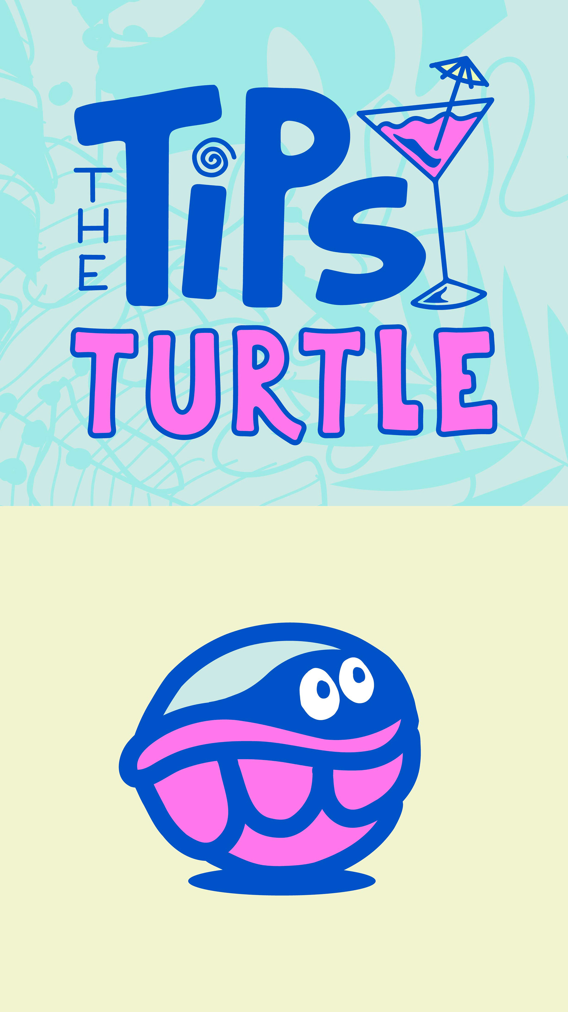
The Tipsy Turtle - Logo Design
The Tipsy Turtle is a vibrant cocktail bar known for its playful atmosphere, tropical touches, and colourful drinks. With a laid-back, summer vibe, it offers a fun escape from the everyday.
I designed a logo that captures this carefree spirit using bold, tropical colours like teal and pink, paired with a hand-drawn style to add warmth and personality.
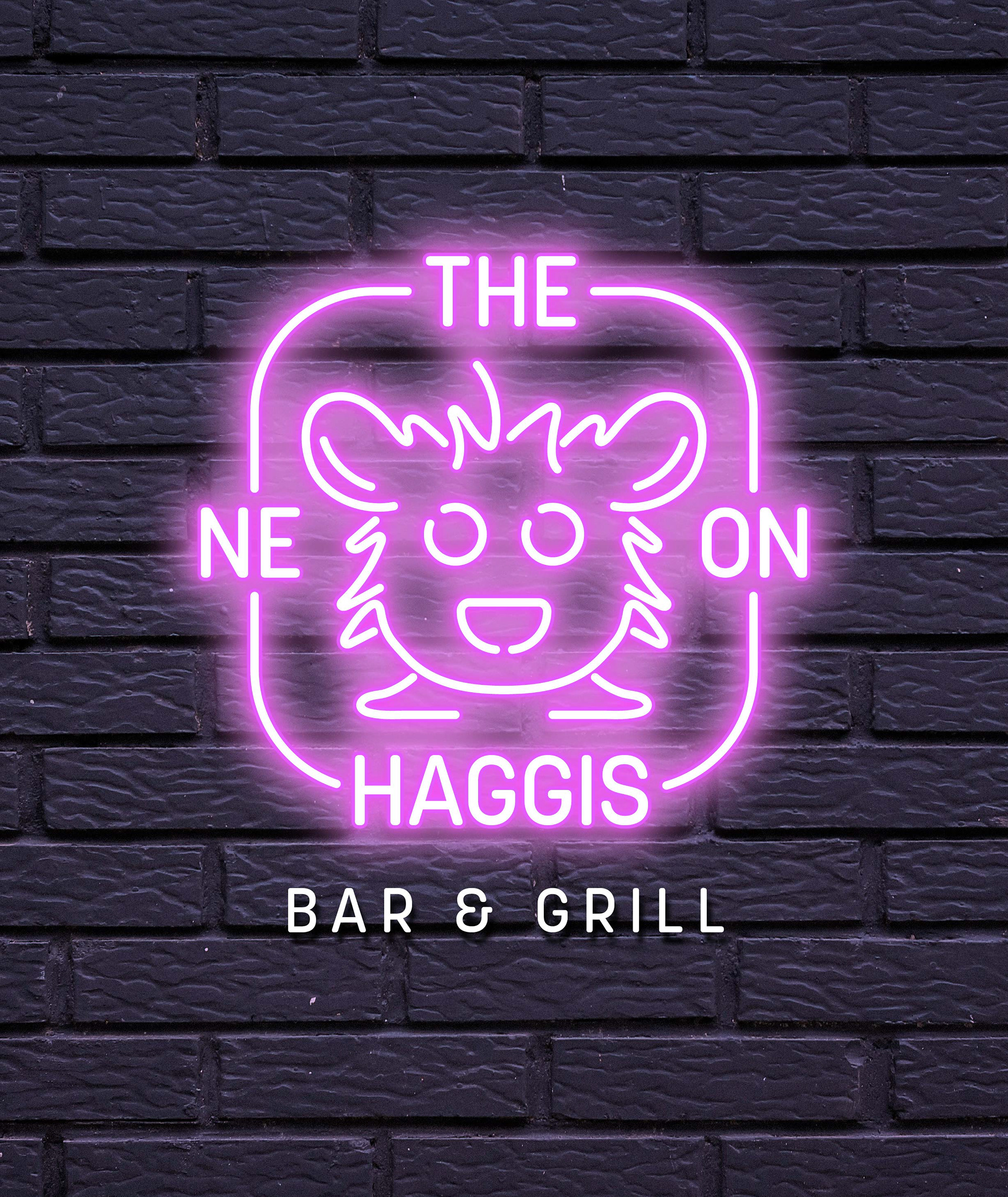
The Neon Haggis — Logo Design
The Neon Haggis is a bold bar and grill that blends Scottish flavour with modern flair. Known for its lively vibe, hearty food, and neon-lit interiors, it offers a fresh twist on the traditional.
I was tasked with creating a logo that reflects this unique mix of heritage and attitude. The result is a striking, contemporary design with strong visual impact—perfectly suited to a brand that’s as fun and fearless as its name.
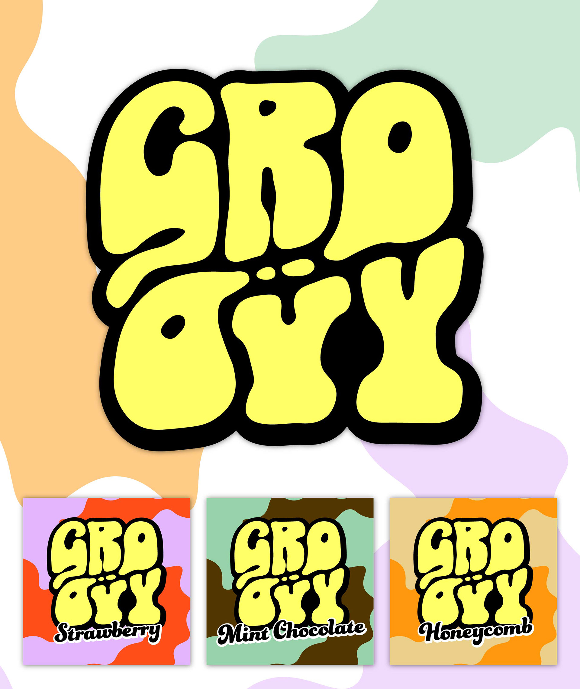
Groovy Ice Cream — Branding & Packaging Design
Groovy is a bold, retro-inspired ice cream brand that brings 70s flair to the frozen aisle. With playful flavours and a colourful personality, it’s designed to stand out and make people smile.
I developed the full brand identity, including the logo and packaging design for retail tubs. The look channels vintage 70s style with vibrant colours, bold typography, and a fun, feel-good vibe that reflects the brand’s joyful, nostalgic spirit.
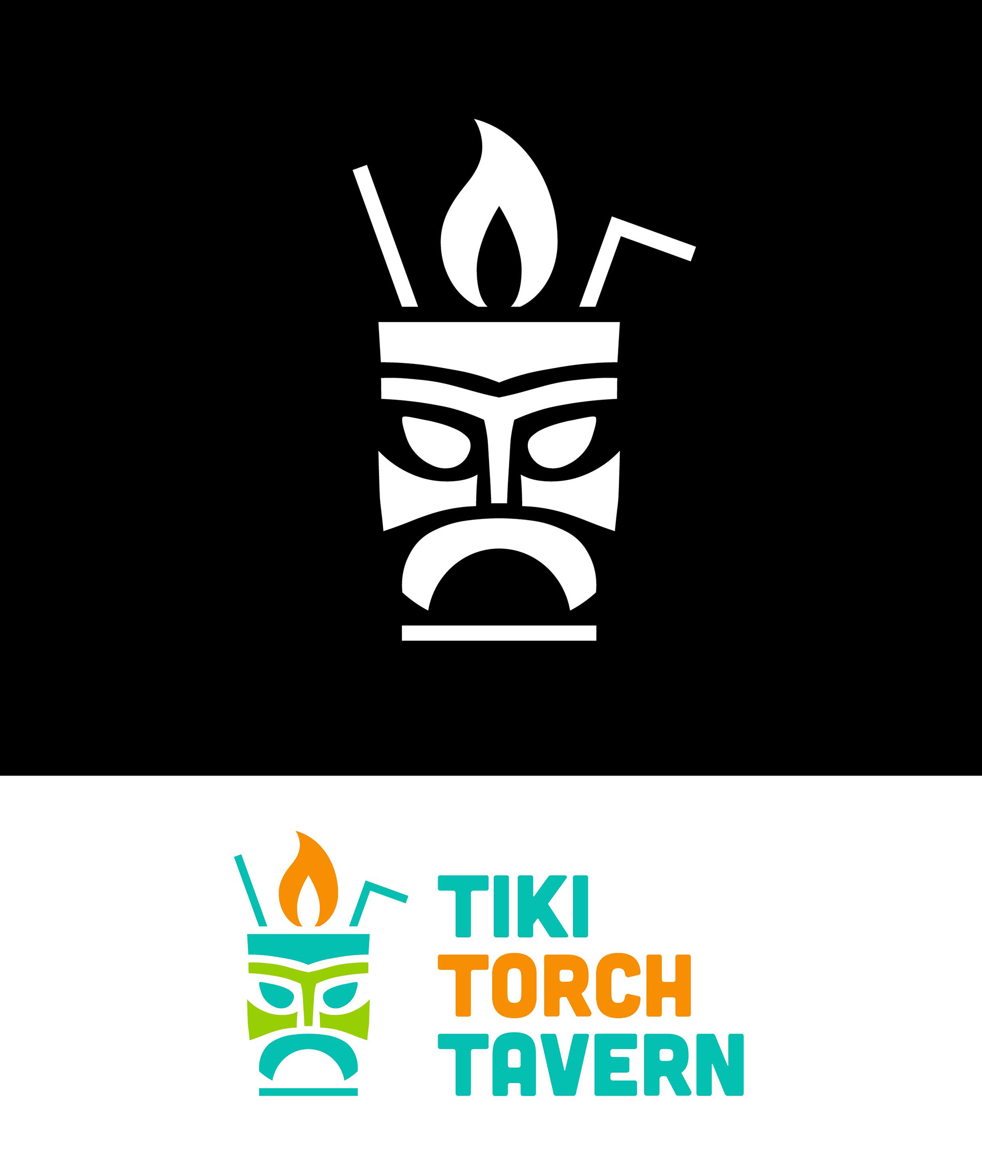
Tiki Torch Tavern – Logo Design
Tiki Torch Tavern is a lively bar that channels tropical island vibes with tiki cocktails, bold decor, and a laid-back atmosphere. It’s a fun, escapist spot where every night feels like a mini vacation.
I designed a logo that captures this tropical energy with a playful, hand-drawn style. The mark combines bold shapes and lively character to reflect the bar’s spirited, carefree identity—inviting guests to kick back, sip something strong, and enjoy the glow.
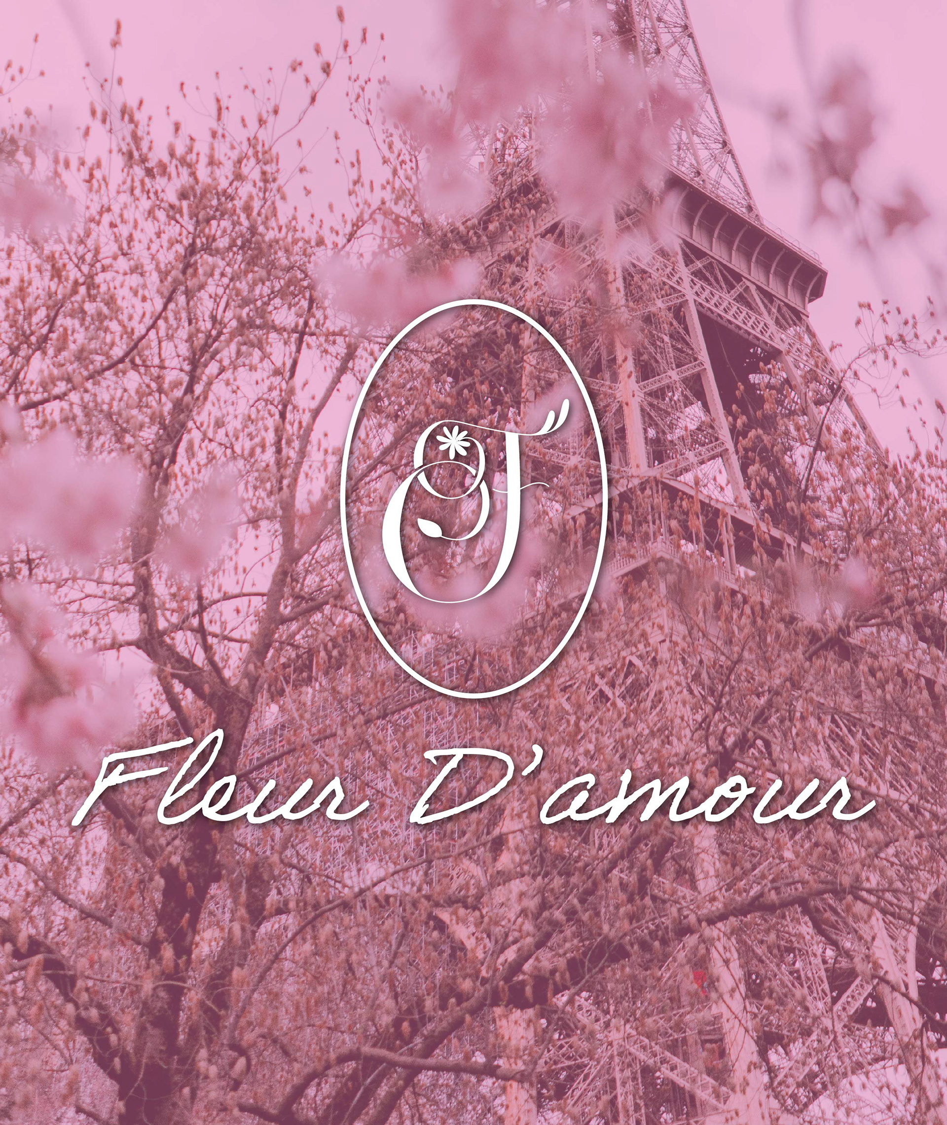
Flour d’Amour — Logo Design
Flour d’Amour is an independent flower shop nestled in a rural French village, known for its romantic arrangements and artisanal approach. The brand captures the charm and elegance of classic French floristry.
I designed a logo that reflects this refined sensibility—traditional, timeless, and graceful. With delicate typography and an elegant layout, the mark evokes the beauty and craftsmanship at the heart of the shop’s identity.
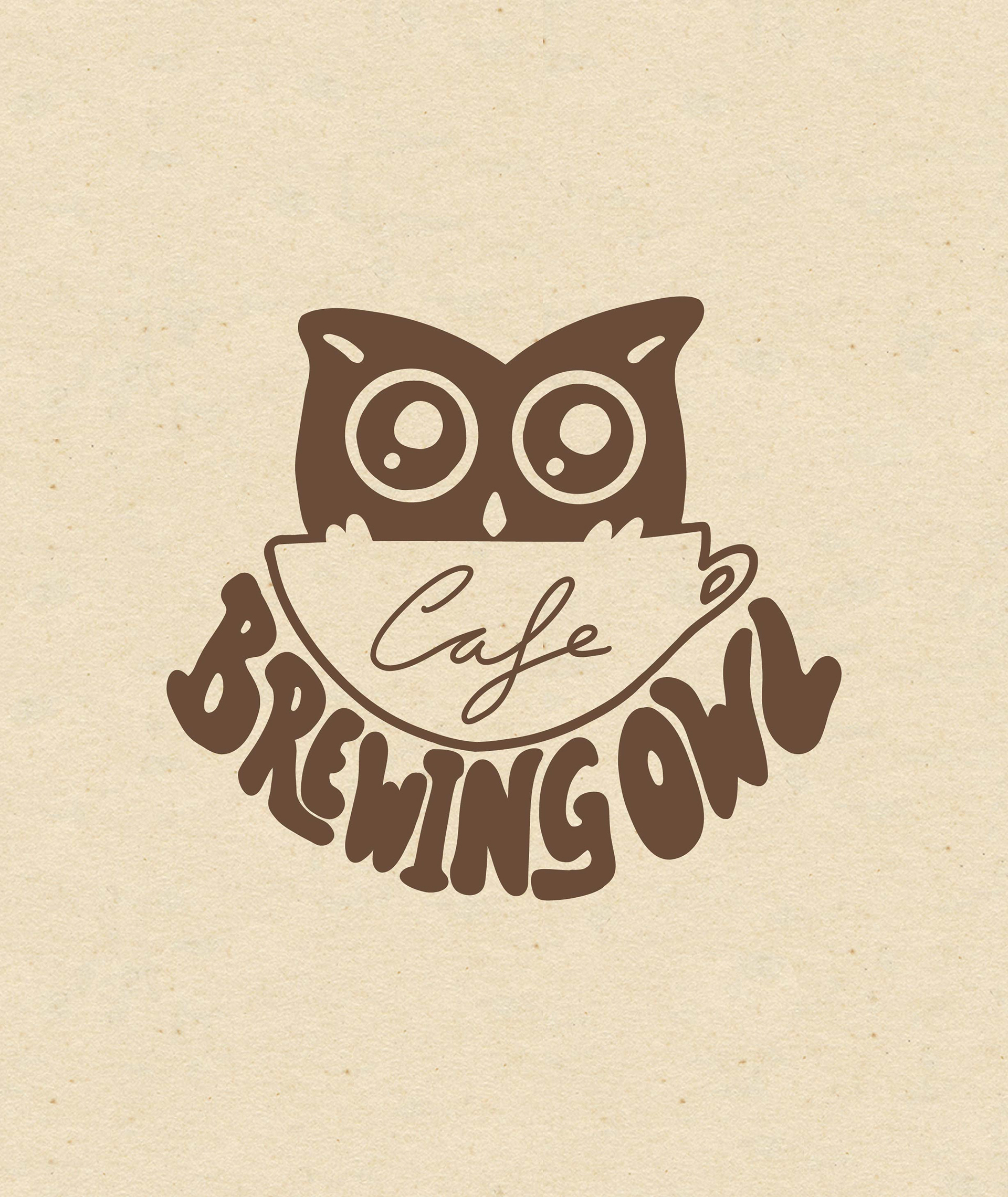
The Brewing Owl Café — Logo Design
The Brewing Owl is a family-run café in the heart of Leeds, known for its cosy atmosphere, quality coffee, and creative brunch menu. Popular with students and local professionals, the café strikes a balance between laid-back charm and urban energy.
I was commissioned to design a new logo that would reflect the café’s personality and help it stand out in a competitive city-centre scene. The final design combines a warm, handcrafted feel with a modern edge—capturing the café’s unique mix of comfort, creativity, and community spirit.
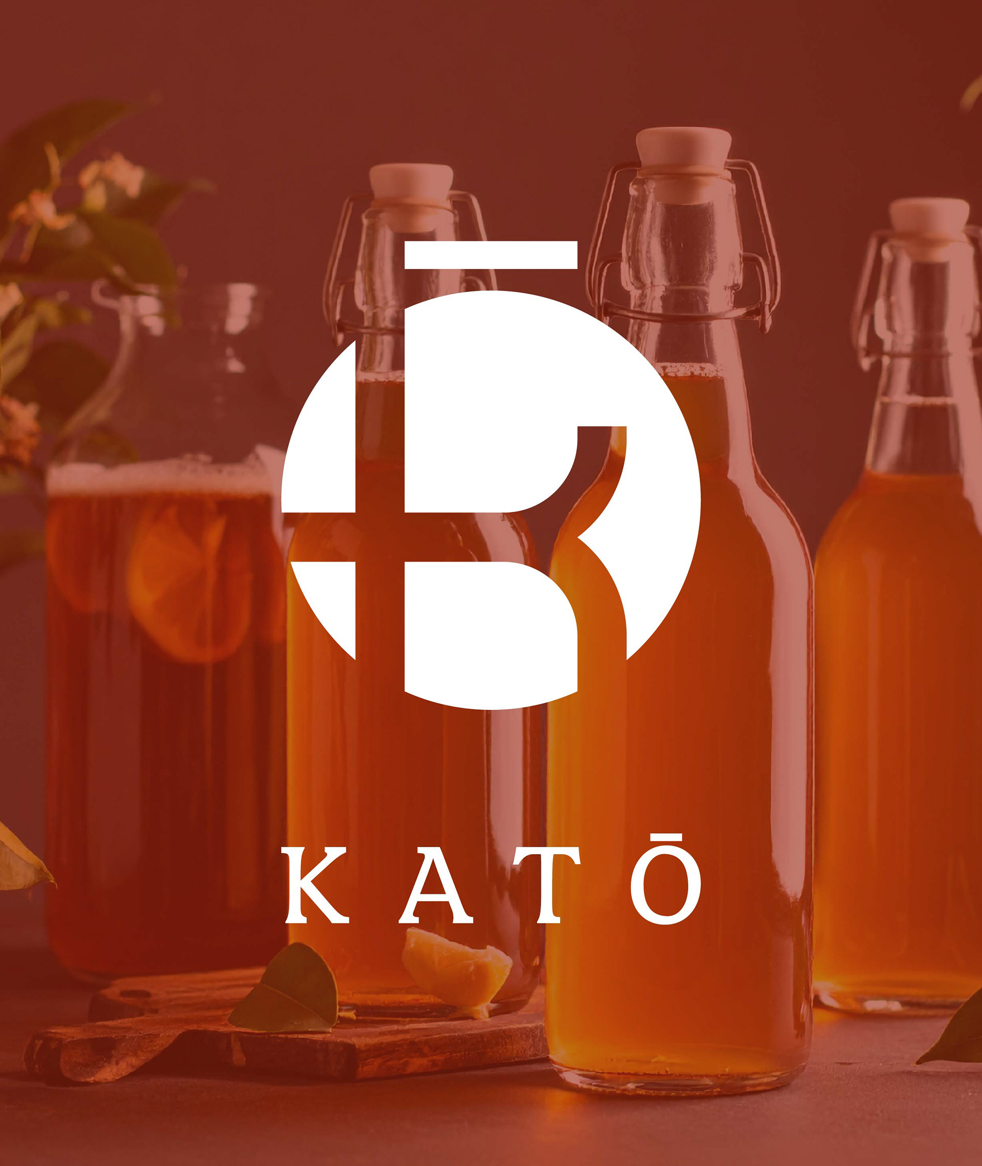
Mister Kato Kombucha Brewing Kit — Logo Design
As part of Mister Kato’s launch of a home-brewing kombucha kit in Japan, I was tasked with designing a logo that captured the product’s fresh, DIY spirit.
The logo needed to feel modern and inviting, while staying true to the brand’s roots in traditional fermentation and Japanese culture. The result is a clean, memorable mark that reflects both the craft of kombucha brewing and the approachable nature of the kit.